Feature request: ability to further reduce margin on smart auto layouts.
For example on attached image there is still a lot of blank space there, despite both margin and bubble spacing options set to minimum values.
Place apps, contacts and bookmarks in Apple Watch style "circle galaxy" on the launcher homescreens or Android Wear watch
Feature request: ability to further reduce margin on smart auto layouts.
For example on attached image there is still a lot of blank space there, despite both margin and bubble spacing options set to minimum values.
If you like what I do please support me on Ko-fi
 Podcast episode about Bubble Clouds
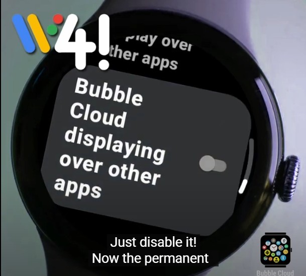
 Is it still possible to hide the permanent overlay notification on wearos 3 or 4?
 Gift a TicPuck to a loved one (or even to yourself!)
If you like what I do please support me on Ko-fi
Copyright © 2026 Bubble Cloud Widgets + WearOS Tile Launcher / Watch Face
