
NOTIFICATION PEEK CARD in Android Wear 2!
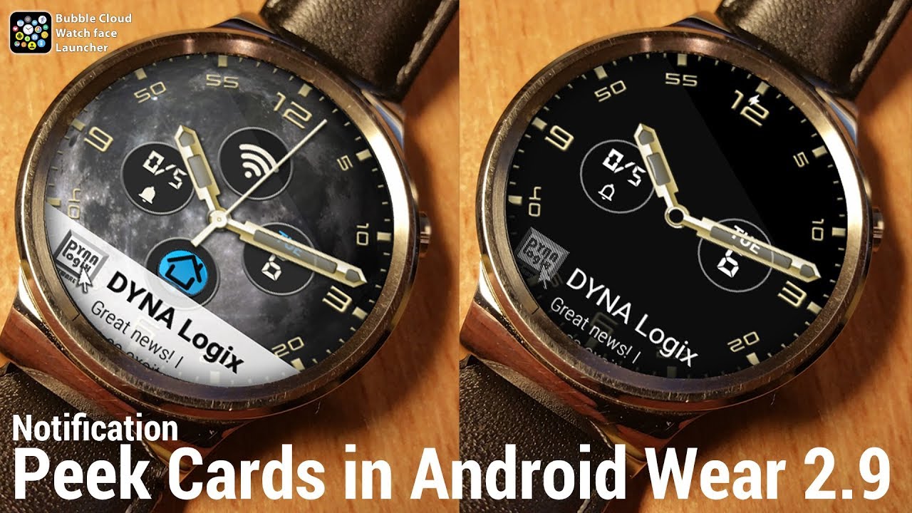
The Bubble Cloud watch face displays long-text type complications in the peek card: I think peek cards are much more practical for long text than dedicating a constant big area of the screen:
► it is more noticeable, but can be hidden to clear your watch face
► choose whether you also want it in ambient mode
► I even made the ambient icon OLED burn in safe
► set its transparency: the watch face can show through behind it
► we are not limited to the white color
See short video: https://youtu.be/Fptcea0lDFc
HOW TO USE
► Adding: “⊕ Add complication” → General → Notification preview
► Swipe down to hide, swipe up to reveal
► Tap to expand notification
► Tap and hold to edit settings:
→ Use +/- to adjust transparency
→ Use palette to change card color
→ Toggle ambient mode (enabled by default)
→ Scroll down for more options
→ Adjust card size (20-40% of screen height)
→ Enable color matching (card color based on icon colors)
→ Blacklist phrases to prevent certain cards from peeking in (default: “No notifications” in various languages, separate entries with semicolon “;”)
→ Delete: remove peek card (detach long text complication)
NOTES
► Vertical swipes still toggle between active/inactive, but you first have to show/hide the peek card: so getting to your actual notifications might require 3 up swipes. Not ideal, but I haven’t found a better way yet.
► Tapping the outside of the analog watch face will still send the watch hands behind the bubbles, but if there is a peek card, it will be behind all
► The peek card can also contain frequently updated information (stopwatch, countdown timer etc.) It works as other complications
► Long pressing the peek card lets you edit it, similar to bubbles. The icon is square and the controls are slightly modified. See all settings above.
► The peek card follows screen rotation if you have it set in Expert settings, but with the following limitations: A) they don’t show on rotated ambient screen B) you will have to swipe perpendicular to the card (original vertical) to show/hide
► “Clock only” ambient mode will still show the peek card but no other bubbles
► Ambient dimming also dims the card (we couldn’t dim the peek card in Android Wear 1.5)
► The card transparency setting affects both active and ambient peek cards
► The ambient peek card is always black with white text, and a mesh is applied to the icon (see screenshot!) to prevent screen burn in for prolonged showing the same notification
► Black/White text color choice follows the same logic, the recently added text color control also affects the peek card
► Title line on peek card is intentionally not bold to prevent burn-in
► Peek card settings are only available on the watch (I don’t plan to include them in the phone app), but they are backed up and restored together with all other watch settings (Wear Cloud Editor → Backup)
► The peek card counts as a watch face complication (it is). Since you can only have one watch face complication in the FREE version, free users will have to chose between complication bubble and peek card
► When editing settings on the watch the preview also shows the peek card, touches are inhibited similar to the other bubbles, but you can still swipe up/down to show/hide the card from the preview.
► Of course you can add any other LONG TEXT type of watch complication, Agenda/next event, Google/Weather, General/Now playing sound to be other good choices. However you can only have one long-text complication at a time, a new selection replaces the previous.


