ROUND OR SQUARE?
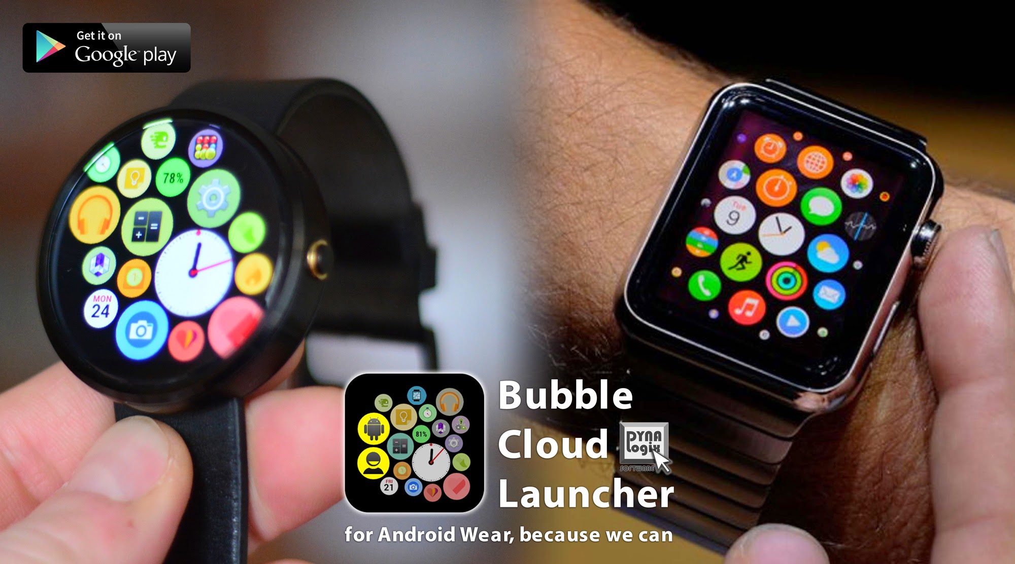
I love my Moto360, and I think with the right software its screen real estate can be used as efficiently as a square. And then it really becomes a question of personal taste.
Designing apps for the round screen is still uncharted territory, in my opinion there are only a few apps taking proper advantage of it. Besides the obvious watch faces Wear tip calculator was one of the earliest great examples to make use of the infinite seekbar capability of a round screen.
I stumbled upon the bubble cloud idea from an unlikely direction, the idea for the layout came from a square display… Other than the first glimpse appearance, there is little common with the source of the inspiration. There’s no animation, instead the circles sizes are used for a more practical purpose, but many seem to agree it provides the most efficient layout to access icons on our round watches.


