Please see the following video (skip intro 0:28)
(see the transcript and watch an extended version of this video below)
The Bubble Cloud watch face works in three modes:
- Active mode – when swipes and long presses are captured by Bubble Clouds
- Inactive mode – when only taps are captured by Bubble Clouds, long press and swipes are handled by Wear OS
- Ambient mode – “Always on” mode, when no input is handled, except to wake the watch
- swipe down for the quick toggles
- swipe up for the notifications (or system app drawer on Galaxy Watch 4)
- long press to pick a different face
- swipe horizontally for Tiles, the Google Assistant or Samsung notifications
- open apps and other bubbles
- swipe horizontally for the app drawer (and Quick Swipe Panel if enabled)
- swipe vertically to show/hide peek card
- long press bubbles to edit them (see Bubble Edit screen)
-
- On the watch:
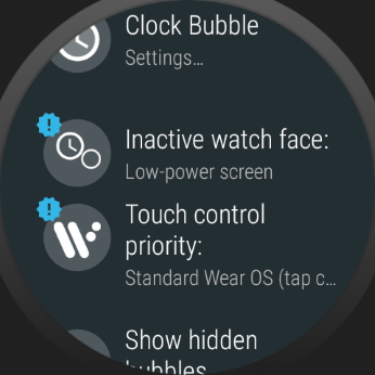
- Option “Touch control priority” has now been promoted to the main settings screen.
- New option “Inactive watch face” only appears in the main settings screen if it is set to “Low power mode” (default of existing users). Otherwise this option is in the Expert section (under “More options”).
- On the phone: “Primary touch control” section added where you can choose whether Bubble Cloud or Wear OS gestures should be the primary controls.“Inactive”, because Bubble Cloud is inactive when Wear OS handles the touches.You can also choose how the watch face should look in this inactive mode. If you choose to make it look like the active mode, little indicator arrows will show up in the non-primary mode:
The light and dark clock symbols refer back to “full-color” and “low-power” modes in previous sections.
Ambient mode is only added for completeness sake, since it will always show the low-power screen.
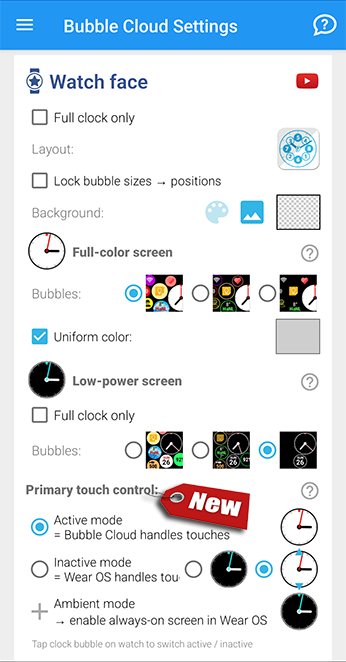
- On the watch:
|
Please note, before version 9.98.4, you could make inactive mode the dominant by disabling the expert option “Priority for Active cloud” – this was replaced by the options explained earlier. 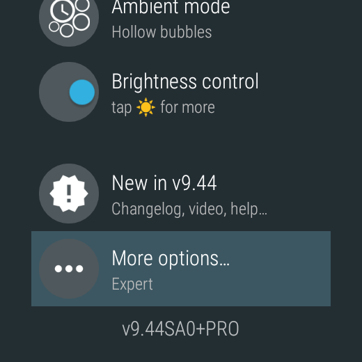 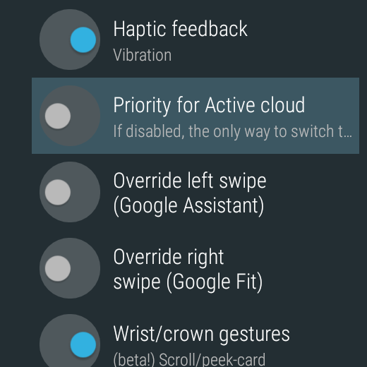 |
Full-color inactive mode
A big improvement for those who prefer standard Wear OS touch gestures over Bubble Cloud’s own swipe and long press behavior.
This is a spin on the disabled option “Priority for active cloud”, which turns Bubble Cloud into a more standard watch face, tap the center of the clock to activate Bubble Cloud, when you can swipe for the app drawer and peek card, and long press bubbles to edit them.
Now the inactive watch face can also appear in full color: with all the bubbles! You will see the low-power ambient watch face only when your watch really enters always-on-mode.
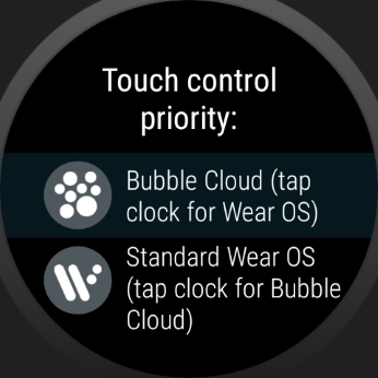
- “Touch control priority:”
- Standard Wear OS (tap ? for Bubble Cloud touches)
- Bubble Cloud (tap ? for Wear OS touches)
and adding a new option:
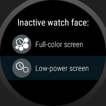 “Inactive watch face:”
- Full-color screen (with/without ◄ indicators ►)
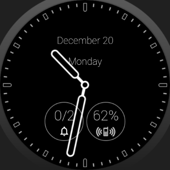
- Low power screen
If we choose Wear OS touches to be registered on the Full-color screen, the active and inactive watch face will look the same. To indicate which mode you are in, little ◄ arrows ► will appear:
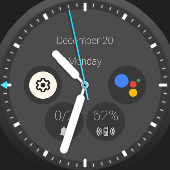
- If you set Priority for Wear OS touches, when you tap the clock to access Bubble Cloud, an arrow will appear in the ◄ direction of the archive cloud (or in ◄ both ► directions if Quick Swipe Panel is enabled)

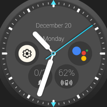
- If you set Priority for Bubble Cloud touches, when you tap the clock to access Wear OS functions, two arrows will appear on the ▲ top and bottom ▼ of the screen:
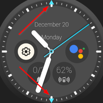
- No arrows are shown in the primary mode, only after the clock bubble it tapped in either Priority mode!
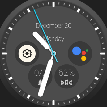
Combinations
The following table shows you how Bubble Cloud behaved earlier with the original “Priority for active cloud” option, and what the new “Wear OS touches in full color” options brings:
Video transcript
Two new watch face options in Bubble Cloud settings:
- First: We can now make the inactive watch face full-color. I call it “inactive”, because special Bubble Cloud features are inactive, i.e. the watch face will act just like every other standard Wear OS watch face.
- With the second option: we can make this standard Wear OS behavior the primary behavior, for the Bubble Cloud features we will first need to tap the clock.
Wear OS priority (=inactive)
So, when we enter the watch face, it looks like any Bubble Cloud watch face theme, but swiping will have the standard Wear OS effects:
- up for notifications or the launcher on Galaxy Watch 4
- down for the quick settings
- left for tiles
- and right for Google Assistant or the notifications on the Galaxy Watch
Tapping the clock will show a little arrow on the side where the Bubble Cloud app drawer is: When you see this arrow, your touches will activate Bubble Cloud features:
- The multi-page app drawer with not only apps, but watch face complications, toggles, and folders of Tasker and Smart home control bubbles
- We can swipe to hide or show the peek card
- Long press bubbles, text fields and peek cards to configure or move them around
- Or tap the clock again to return to the standard Wear OS functionality (notice this is the primary control now, so the little arrow disappears)
Bubble Cloud priority (=active)
Alternatively we can make Bubble Cloud touch controls the primary.
When we set it up this way, returning to the watch face the Bubble Cloud features will be prioritized:
- this is when wrist gestures work on the watch face
…and everything else Bubble Cloud can do, which I showed you a moment ago.
But this time this is the primary behavior, and now we need to tap the clock before standard Wear OS actions, like accessing the tiles or the quick settings.
See, now the little arrows appear on the top and bottom of the screen, indicating we are in the standard Wear OS mode:
- where we can swipe up or down,
- of course sideways as well.
But every time we return to the watch face Bubble Cloud features will take priority.
So these are the two options. You can now decide which behavior you would like to take priority: Bubble Cloud or Standard Wear OS.
Either way, the watch face will still look the same, and the other can be accessed after tapping the clock (and that’s when the indicator arrows are shown).
Always-on screen (=ambient)
Of course, when the watch enters always-on ambient mode, we still get Bubble Cloud’s highly customizable low-power screen:
- with the true black background which guarantees power saving
- we can selectively show just the bubbles we want
- and the thick fonts and notification bubbles will appear using their burn-in safe outline variants
- or the unique, granular control of ambient brightness, or even automatically dim this ambient watch face at night
Bubble Cloud watch faces
I think with this new option you can enjoy without compromise all the advantages of using Bubble Cloud as your watch face:
- all the analog, digital, worded (in any of 11 languages) or dual themes
- notification icons
- peek card
- deep Tasker control
and amazing flexibility and customizability.
Lock primary control
We can now prevent accidentally switching between the active and inactive watch face. Under Shortcuts, set “2×tap clock” to “Exit primary mode”. For details see Lock primary mode
Demo video (longer version)
- 0:00 Intro
- 0:42 Showcase of top Bubble Cloud watch face features
- 8:40 Explanation of the new “Touch control priority” options
- 13:00 How to set up the Wear OS tile if used with a different watch face
More information
Read about the background, why the app works like this (and ways around it) in Watch Face Introduction.

