UPDATE
I started programming the phone notification system I discussed earlier. I reverted to the “Phone-notification-bubble(s)” idea:
► I don’t want to make the peek card more confusing
► the row of icons only looks good on digital watch face, having them as bubbles takes better advantage of the flexibility Bubble Cloud already has
OTHER DEVELOPMENTS
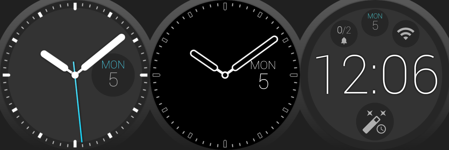
I am putting this new functionality into a paid plugin (a bit similar to the Wear Stand Up Alert plugin, that works together with Bubble Clouds. It will even come with a bonus minimalistic theme, one which is highly configurable, has a thin font and works well both as analog and digital face:
► it is a complex feature, the main app is already bloated enough
► the additional functions can be easily separated
► it is easier to market if I can devote a full Play Store entry to it
► when installed before Bubble Clouds, the main app can auto-configure itself, just like it does now if new users install a theme pack first, and then the main app.
I keep you posted on the progress.


