
Version 8.84 → Play Store
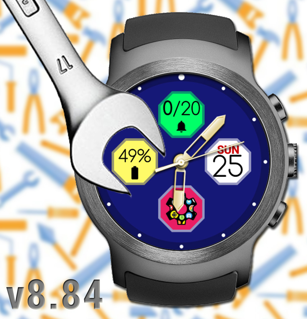
This is a “tweak” update, correcting a few bugs the last big update surfaced and further improving the new features:
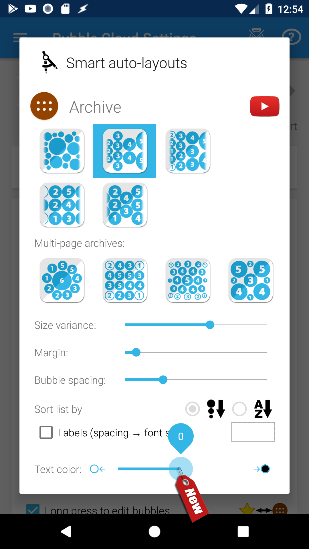
► New option “Text color”: explanation below
► new “Delete” button in Bubble Edit screen on watch to make deleting complications and folders easier [tip: Alden]
SMALL IMPROVEMENTS
► Updated some older youtube videos linked inside the app
► Updated greeting text for first time installers
► Improved handling of range type complications in Wear Cloud Editor
► Tweaked the text color in info bubbles
► Show hint on how to delete folders on the watch
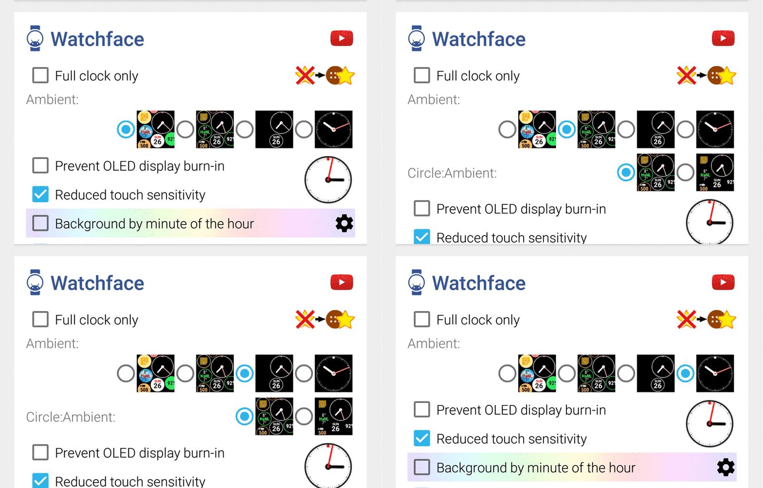
► More logical control of the availability of the circle:ambient setting (it’s only shown when it has effect)
BUG FIXES
► Workaround for a rare wifi bubble related bug
► Avoided bookmark widget crash if there is no browser installed
► Show “full clock only” in the cloud list if this mode is enabled in the Watchface settings card [tip from Elaine Burks]
► Range type complication outline stroke color problem fixed
► Control “Circle:Ambient” in selective ambient mode regardless of the active mode bubble settings [thank you Bruce Wagner]
► Fixed 2 separate, but pretty rare crashes in Wear Cloud Editor
► Prevented double tapping bubbles in Wear Cloud Editor (caused crash)
► Fixed a premature complication update related crash on the watch
► Fixed layout of 2nd page of intro slider on watch (folder clouds)
► Rare crash on watch after editing a bubble
► Spacing/margin was not updated in folder preview when adjusted using the controls on the watch
► Fixed a very rare crash when a notification appears during watch face init
TEXT COLOR
I have been constantly tweaking the text color algorithm in every recent update to improve visibility of the text displayed in LiveInfo and Watchface Complication bubbles. The algorithm decides whether to use white or black text depending on the color luminance of the bubble, but based on the feedback from Bruce Wagner I have now added an override option to adjust the cut-off color intensity:
Normally my algorithm would use white text on bubbles with luminance below 50%, and black above. Some icons and title text have a slightly different cutoff level so medium level bubbles can have a little variation: white text with black icon for example.
Using the new control (in the cloud edit screens on the watch, and in the Smart Auto Layout dialogs on the phone) you can now modify this cutoff level:
► left of center: bias towards lighter text
► center “0”: default
► right of center: bias towards darker text
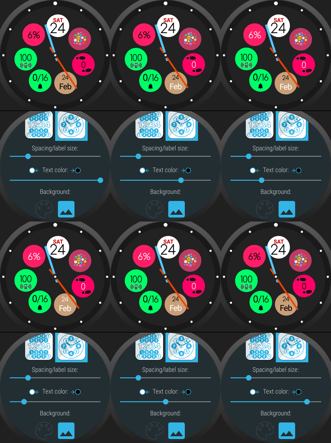
Pushing the seekbar to either extremes will turn all text white or black (except for extremely dark or light bubbles).
See the effect of this setting in the animation below
———————–
Detailed change log: http://forum.xda-developers.com/general/paid-software/app-bubble-cloud-widgets-applewatch-t2898592/post56270161#post56270161
As you can see, ton of new things added, the app is being developed actively. If you find any bugs or crashes, please contact me so I can fix as soon as possible.
★★★★★
THE PROJECT NEEDS YOUR HELP
My app is getting an increased number bad ratings lately. If you like the app and the progress please support the project with a 5★ rating. It helps tremendously: https://play.google.com/store/apps/details?id=dyna.logix.bookmarkbubbles
Thank you!
★★★★★
#tasker #aw20 #standalone #androidwear #moto360 #hwatch #zenwatch2 #lggwatch #sonysmartwatch3 #sonysw3 #lgwatchurbane #watchfaces #watchface #HuaweiWatch #LGUrbane #Smartwatch3 #zenwatch3 #androidwear2 #complications #remap #button
#widgets #theming #personalization #novalauncher #launcher


