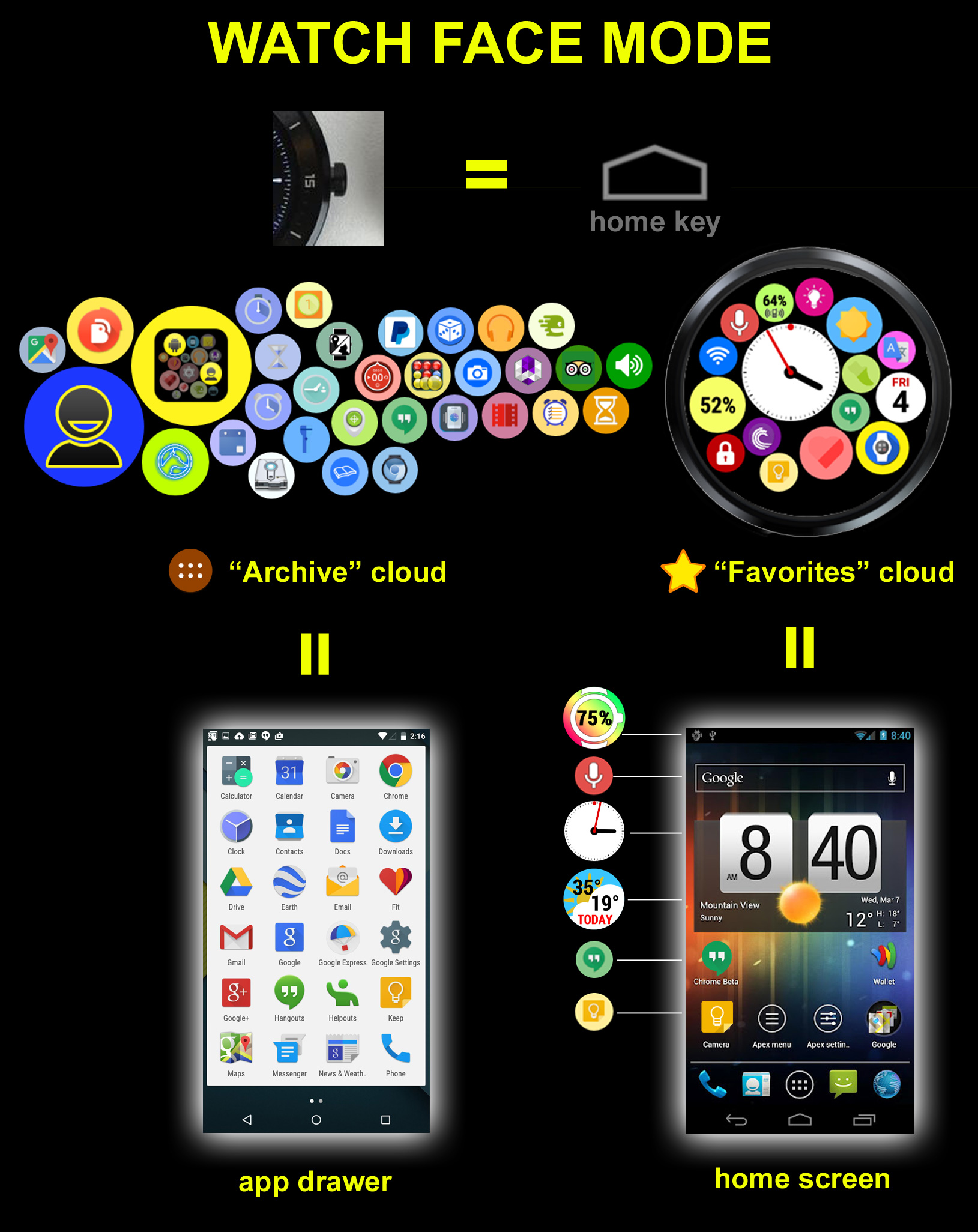
Watch face mode = Regular Android Home Screen + App drawer
ANALOGY
If the watch face mode feels natural, this is the reason: it basically brings the regular Android home screen + app drawer duo to your wrist.
To some this is blasphemy, they like the watch to have a minimal UI, to others this is a welcome option. Bubble Cloud’s watch face mode appeals to the later group 🙂 *
The favorites group lets you have all which a regular home screen usually has:
►Clock
►Weather
►Voice search
►Battery
►Power toggles
►and a few of the most used icons…
The rest of the app icons reside in the drawer. Which comes in from the left instead of the bottom in Bubble Cloud Launcher.
*If you only want the app-drawer, without any of the home-screen like stuff, just use any other watch-face, and you will still be able to pull the two clouds in from either the left or right (select in the Bubble Cloud app on the watch).


