Notification (status bubbles) are generally not compatible with manual layouts generated with the layout designer, since the manual layout doesn’t allow for easy addition and removal of bubbles from the watch face – one of the strength of Bubble Clouds.
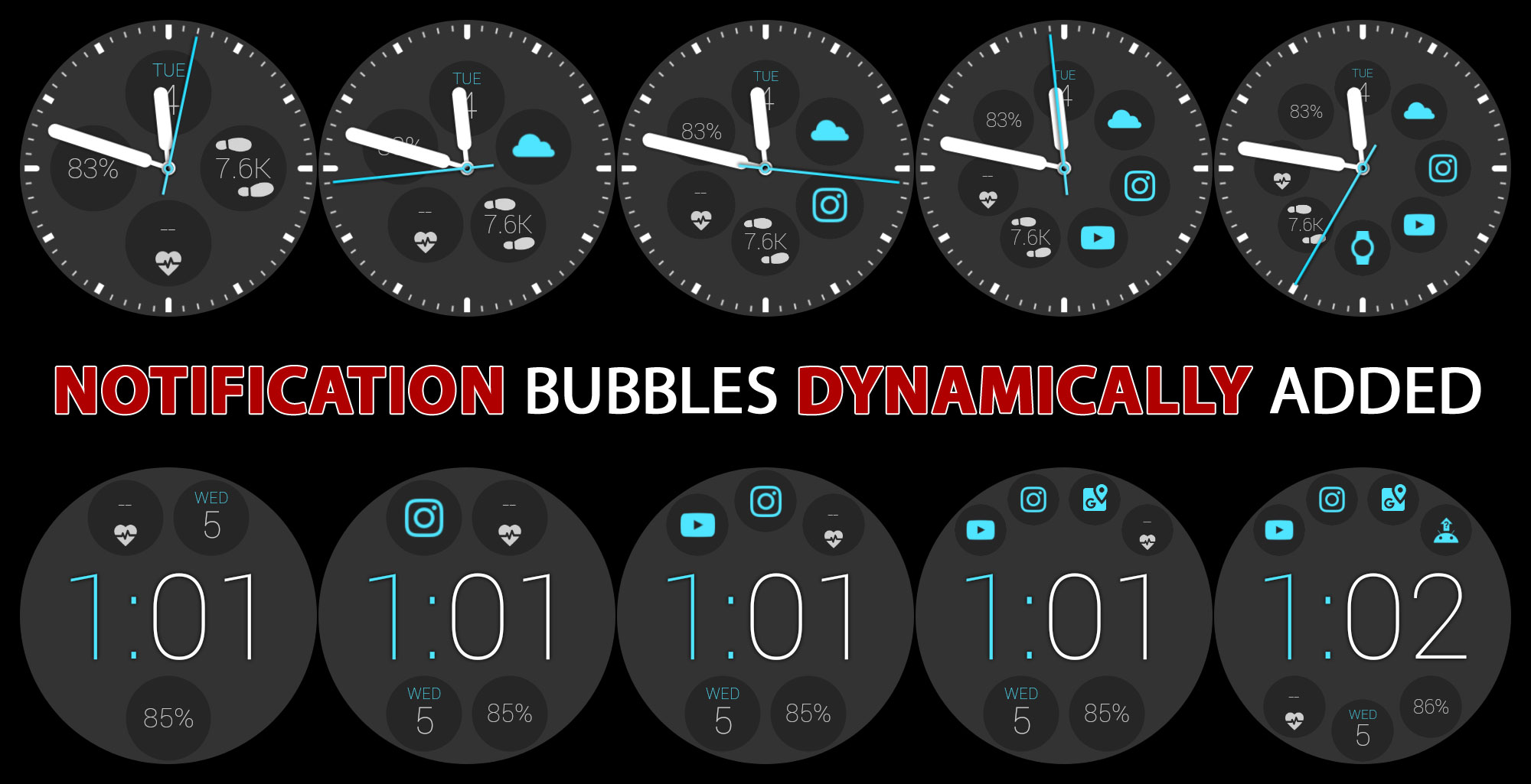
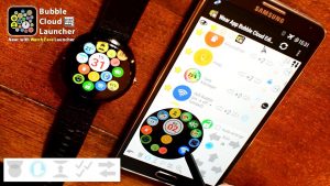
I would recommend using any of the Smart-Auto-Layouts. The “split” layout (shown above) for example arranges the a 1-row time and any number of bubbles above and below. You can have the date, step count, battery or anything you need on your watch face plus any number of status bubbles. If you rather use an analog watch face, the standard “clock” smart-auto-layout is recommended.
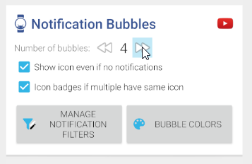
Also, make sure to set the maximum number of notification bubbles high enough, and that you don’t have any filters that are too strict, but if the status bubbles show up in your archive, those settings must be OK:

Order of the bubbles
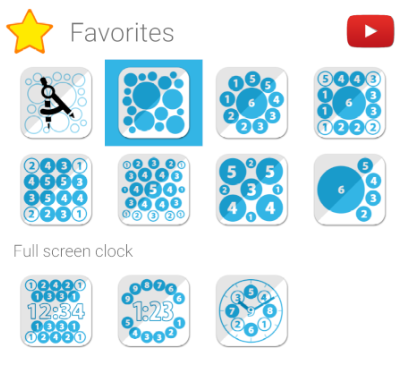
I see people using the layout editor to try to control the order of the bubbles. The bubble weights in a Smart Auto Layout control their order. Those are the little numbers in the layout images:
Layout variants
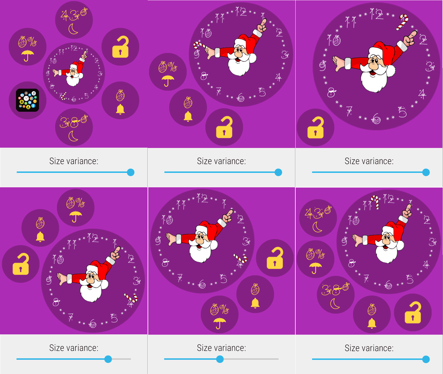
In many of the Smart Auto Layouts the “size variance” (sometimes labeled as “info location” or “number of bubbles“) parameter lets you control bubble distribution:
Archive cloud
You can also use the bubble weights to control which screen the bubbles show up in the archive (app drawer) area. It’s explained in this post: https://bubble.dynalogix.eu/2016/12/10/assign-bubbles-to-archive-pages-v705/
Using Custom Layouts
Finally, if you still insist on using the manual layout editor, there is also a way… Just make sure to edit the custom layout when there are enough active notifications, they will then show up in the layout editor. You can move them to their desired locations, and later, when you have fewer bubbles, some bubble slots will stay empty. But as I said, this is not the recommended way to use the notification bubbles.

