States: active, inactive, ambient
Active vs. inactive vs. ambient screen
The Bubble Cloud watch face works in three modes:
- Active mode – when swipes and long presses are captured by Bubble Clouds
- Inactive mode – when only taps are captured by Bubble Clouds, long press and swipes are handled by Wear OS
- Ambient mode – “Always on” mode, when no input is handled, except to wake the watch
- swipe down for the quick toggles
- swipe up for the notifications (or system app drawer on Galaxy Watch 4)
- long press to pick a different face
- swipe horizontally for Tiles, the Google Assistant or Samsung notifications
- open apps and other bubbles
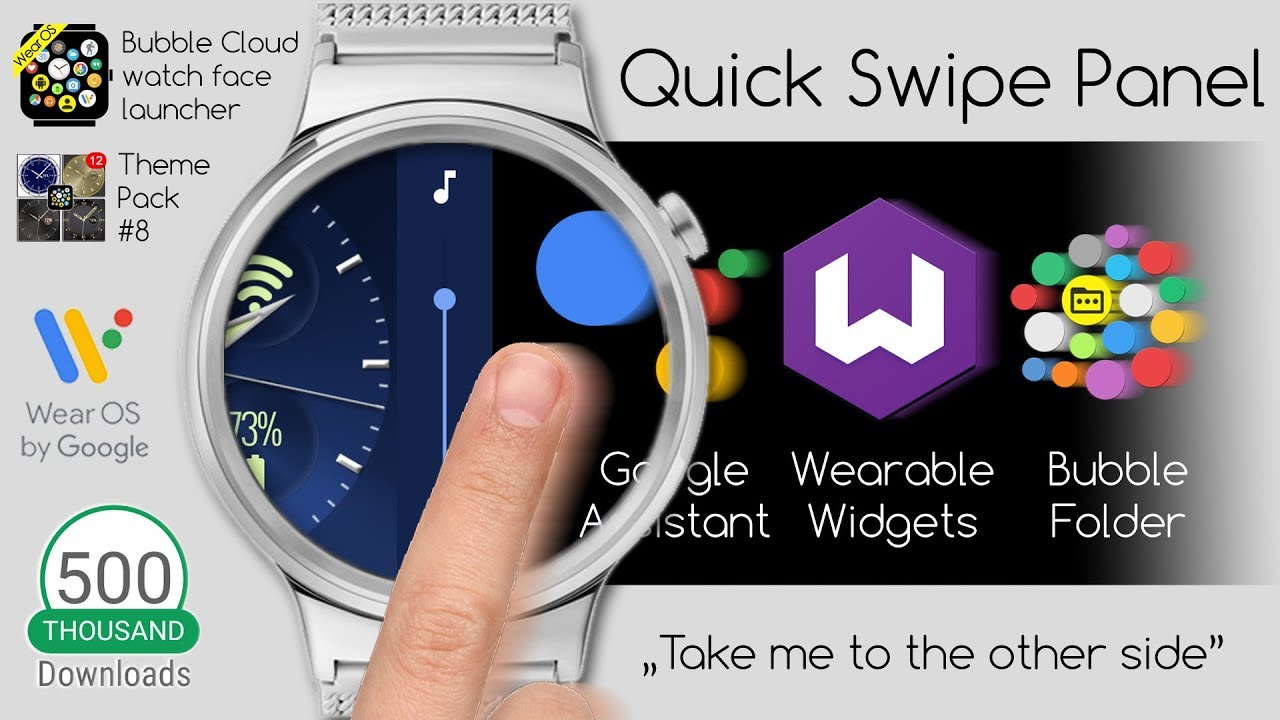
- swipe horizontally for the app drawer (and Quick Swipe Panel if enabled)
- swipe vertically to show/hide peek card
- long press bubbles to edit them (see Bubble Edit screen)
- On the watch:
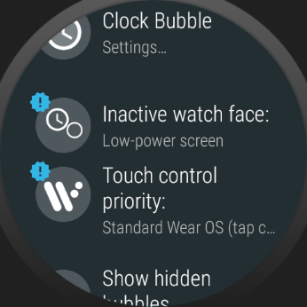
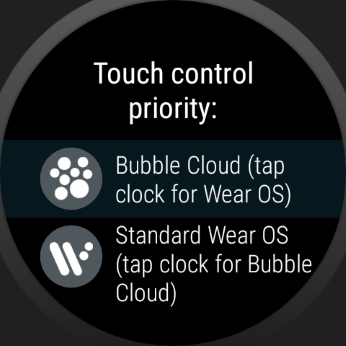
- Option “Touch control priority” has now been promoted to the main settings screen.
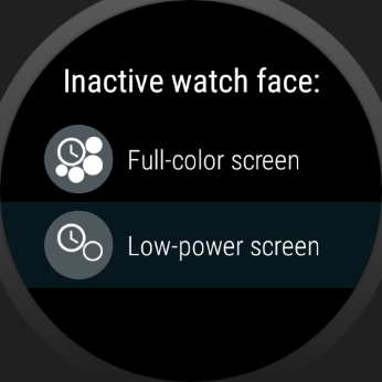
- New option “Inactive watch face” only appears in the main settings screen if it is set to “Low power mode” (default of existing users). Otherwise this option is in the Expert section (under “More options”).
- On the phone: “Primary touch control” section added where you can choose whether Bubble Cloud or Wear OS gestures should be the primary controls. “Inactive”, because Bubble Cloud is inactive when Wear OS handles the touches. You can also choose how the watch face should look in this inactive mode. If you choose to make it look like the active mode, little indicator arrows will show up in the non-primary mode:

The following video explains this in detail
For more information please see the post
A) A little background
I call it “inactive” or “ambient” mode when this layer is hidden. In the inactive screen you can access all the regular watch face functionality: swipe down for the quick settings, swipe up to access notifications, sideways to switch watch faces.
We can toggle between active and inactive by tapping the clock bubble, and recently I also added vertical swipe gestures too to switch between the two modes. So the first vertical swipe will toggle to inactive, then the regular Wear OS functionality kicks in. This is still not ideal, but maybe a little bit more intuitive to swipe twice instead of a tap-and-swipe.
Depending on the watch-face layout, you can even toggle the position of the hands and bubbles on the watch face. Tapping outside the ring of bubbles will bring the bubbles to the foreground (even over the peek card), Tapping again, or tapping in the center of the watch face will switch to inactive mode: (I call this the “reveal” mode)
[Theme shown is from pack #4]
Unfortunately there is no other way to implement all this increased functionality. Hopefully understanding how it works makes it easier to use.
- we get to override the horizontal swipe to change watch face
- we get notification peek cards (see below)
- we get unlimited number of watch face complications which can even be put in the archive cloud and folders
- the Bubble Cloud watch face is extremely battery friendly, our watches will last longer than with other watch faces
(except that your watch becomes more useful, and since you will be using it for more…) - you can apply many different watch face styles I call “1-click themes”, and even mix different components of these themes

