Regarding the idea for the bubbles interface
[history, if you care to read about it]
It was funny how it came. Apple is in the story, but not as you’d think.
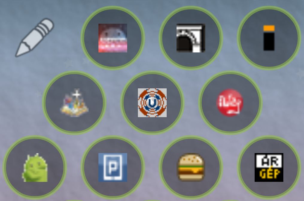
I looked for, but could not find a bookmark widget that would allow me to add the only bookmarks I want (I didn’t need browser sync, which every other bookmark widget does). So I decided to make an app for myself (hence the package name dyna.logix.bookmarkbubbles). I came up with the idea, that the bookmarks could be circles [see the attached screenshot from v0.1 of the app from about a year ago Aug/2014].
Then I saw the first leaked renders of the apple watch. They are doing bubbles too. And what a cool idea, they make the bubbles different sizes! I will do that too!
I didn’t realize what made one bubble there different size from the others, I assumed it depended on how much each bubble was used. So I thought I was implementing apple’s bubble system, only later did I realize the boring truth about their bubbles = always the center one that is bigger… and that the idea I attributed to them was actually mine 🙂
App bubbles and contact bubbles came much later (all by user requests), together with the android wear launcher.
Currently the bookmark bubbles are the least used and least developed part of the app, I might spend some time with it to bring it to parity with the rest of the app.


