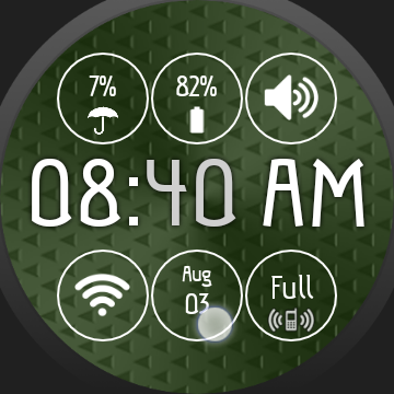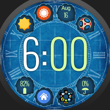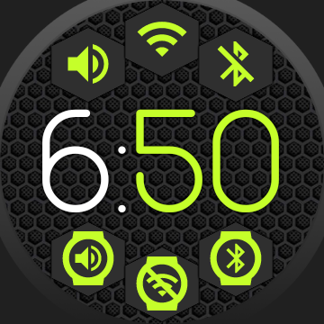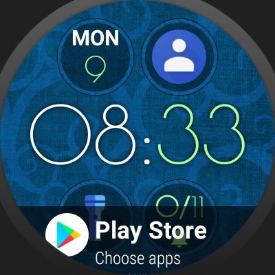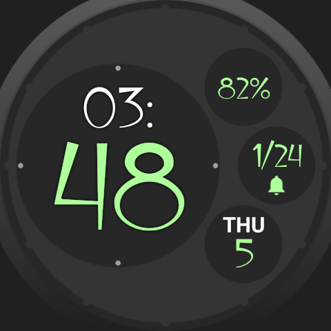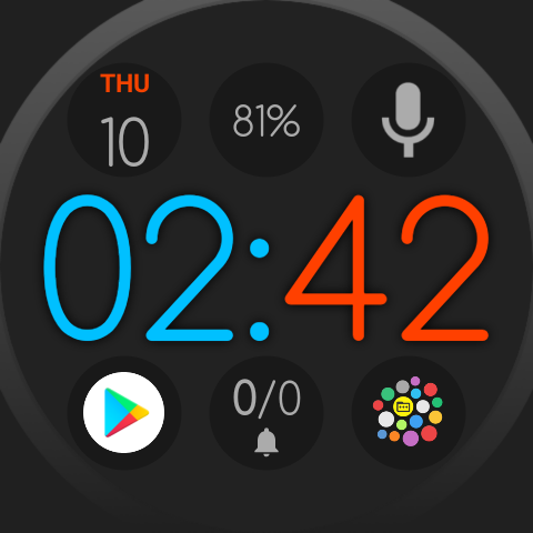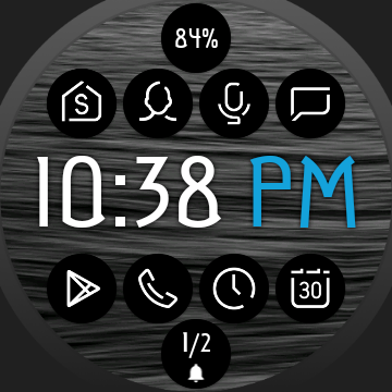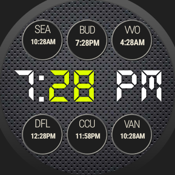
Custom layout editor
It’s in the app for backwards compatibility, but there are much better options to make beautiful watch face arrangements. I recommend using one of the Smart Auto Layouts instead, as these place the bubbles more precisely for a much more even look. As an added advantage they are also dynamic, which means if you add or remove bubbles you will not need to rearrange the bubbles. For example in the “Round” or “Square” arrangement the center bubble is automatically resized and the bubbles around it are automatically arranged.
History: The drag-and-drop custom layer editor was in the app before the Smart Auto Layouts. But I recommend using Smart Auto Layouts instead for the above listed reasons. I don’t plan to develop the custom layout editor further, but I am absolutely open to more layout ideas which I could add. Just in the last two updates of the app I added a new Auto Layout and improved another one.
Dynamic Bubble Clouds
I feel the strength of this app, is how easy it is to rearrange things on the fly:
- You are going to need the calculator more in the next couple of days, simply long press the bubble and move it to the watch face. It’s that quick and easy. Everything gets rearranged in the app drawer and the watch face.
- You find you need a watch face complication less, again, long press its bubble and move it to the app drawer or even into a folder.
- With a single setting you can switch which folder is assigned to the tile.
- You need a digital clock in the next hour, use one tap and you switched your clock bubble to digital. The rest works as before.
- You put a different watch band on your watch, with a few clicks you can switch to a different 1-click theme that matches the new band better. The watch face changes looks completely, but your complications, bubbles and everything else keeps working as before.
The custom layout, which needs a lot of fiddling every time you add or remove bubbles doesn’t fit this philosophy behind Bubble Clouds. It is in the app, because other watch faces do it this way, and users asked for it. But I still think it is not the best way to do it.
Smart Auto Layouts
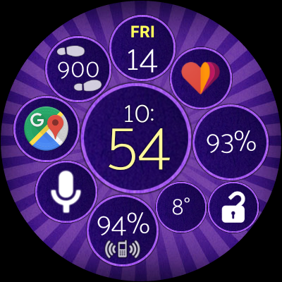
You can select the Smart Auto Layout both on in the settings app on the phone:
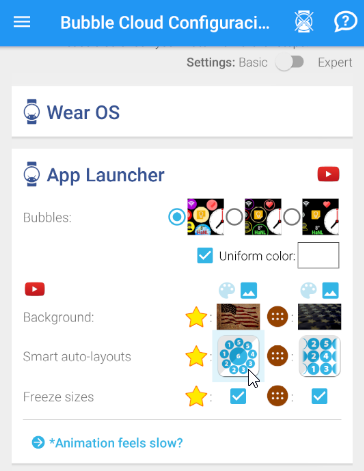
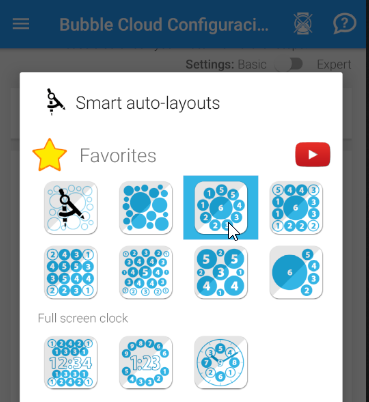
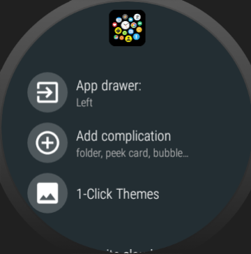
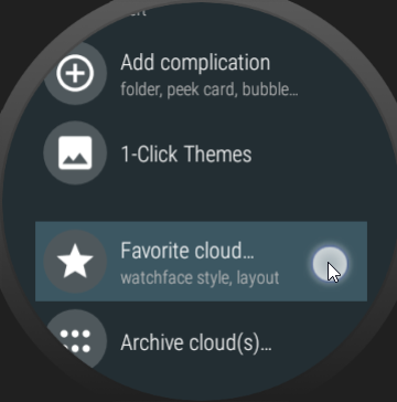
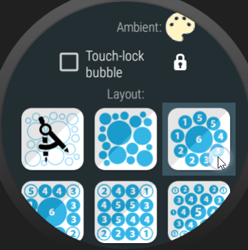
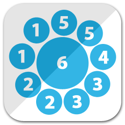
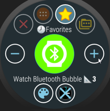
Use the (+) and (-) buttons to adjust the weight (it’s set to “3” in the above screenshot)
Fonts
Many are keep using the default font built into their watch. I would like to direct your attention to the 1-click themes in the app. There are much nicer, stylish fonts available. I recommend checking out the theme packs, each come with 5-6 different font sets which can improve the readability and appearance of your watch face:
Using the manual layout designer is not recommended, since the manual layout doesn’t allow for easy addition and removal of bubbles from the watch face – one of the strength of Bubble Clouds.
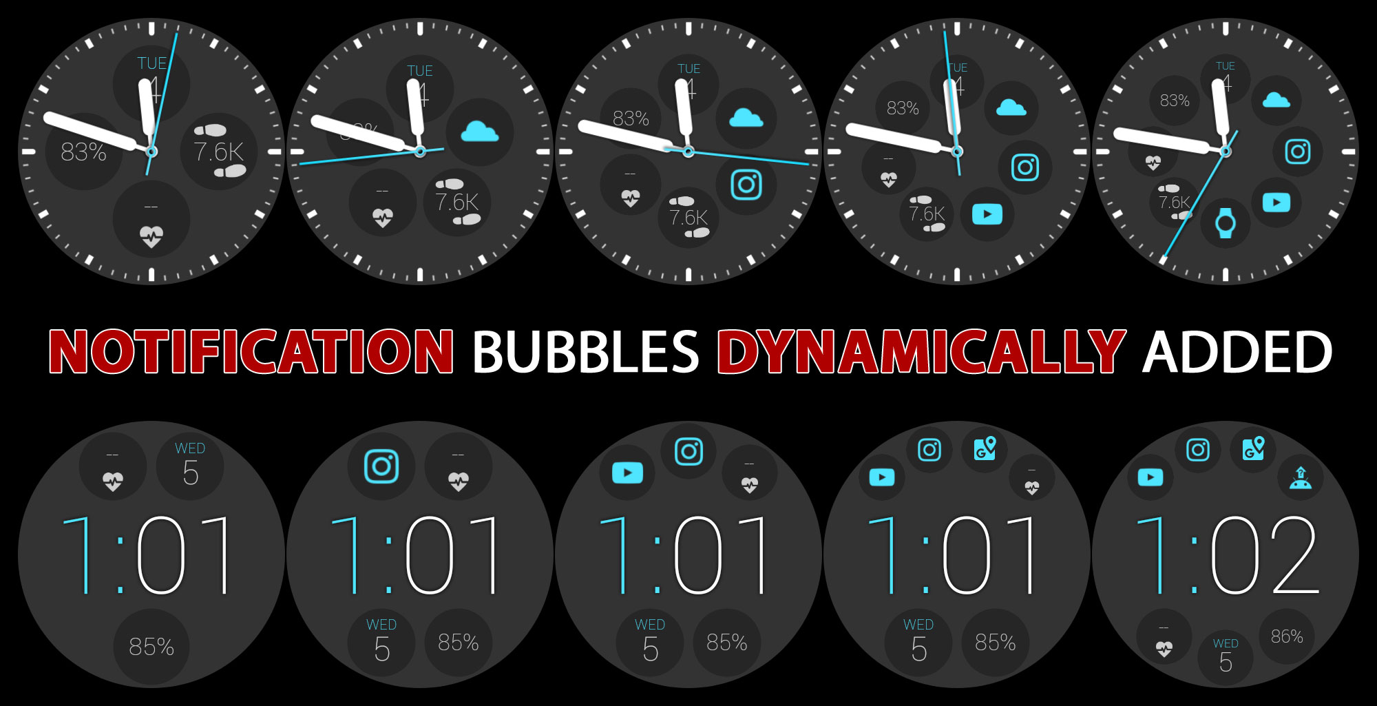
I would recommend using any of the Smart–Auto–Layouts. The “split” layout (shown above) for example arranges the a 1-row time and any number of bubbles above and below. You can have the date, step count, battery or anything you need on your watch face plus any number of status bubbles. If you rather use an analog watch face, the standard “clock” smart–auto–layout is recommended.
I see people using the layout editor to try to control the order of the bubbles. The bubble weights in a Smart Auto Layout control their order. Those are the little numbers in the layout images:
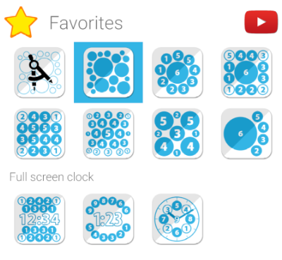
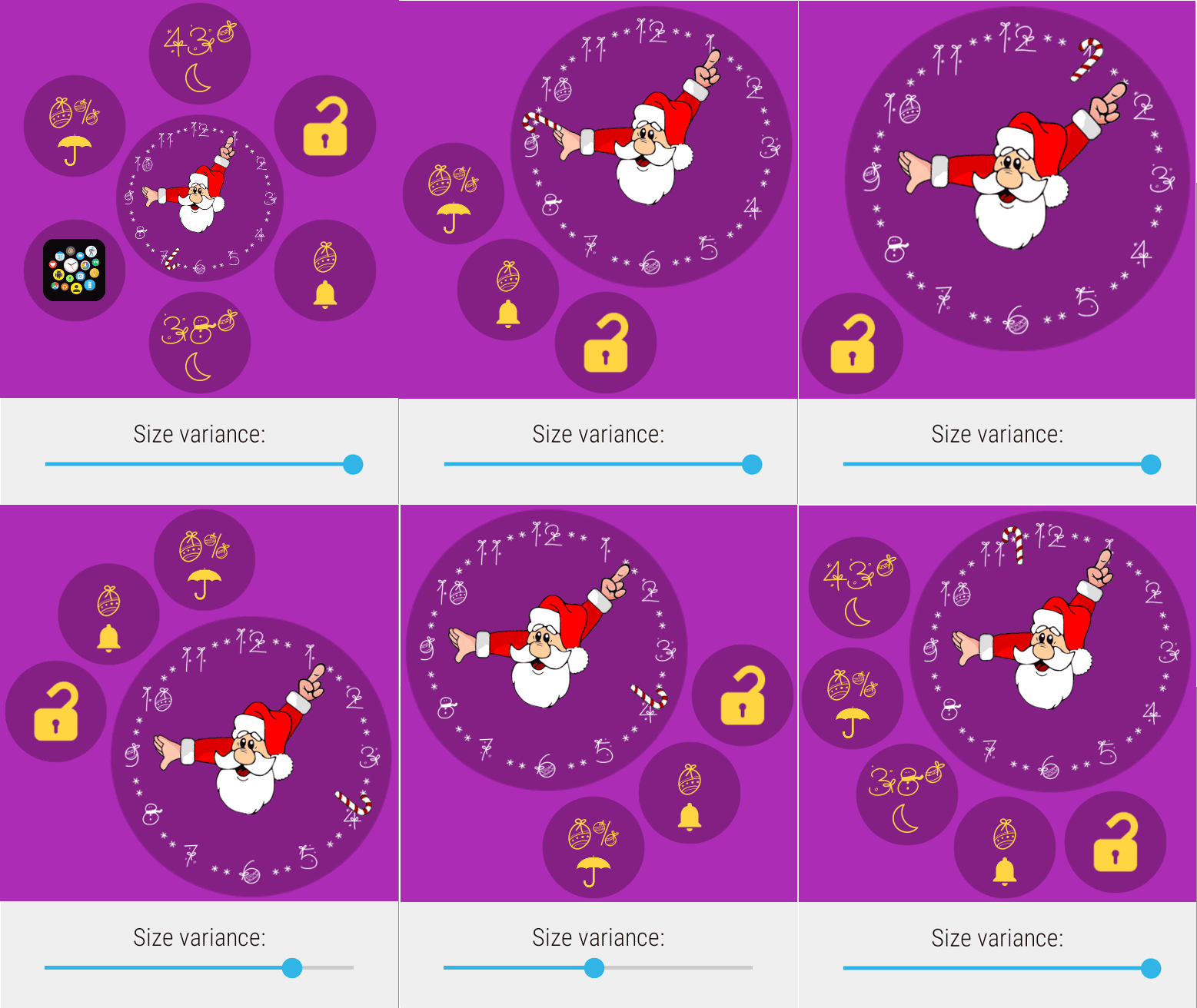
In many of the Smart Auto Layouts the “size variance” (sometimes labeled as “info location” or “number of bubbles“) parameter lets you control bubble distribution:

You can also use the bubble weights to control which screen the bubbles show up in the archive (app drawer) area. It’s explained in this post: https://bubble.dynalogix.eu/assign-bubbles-to-archive-pages-v705/

