What’s new
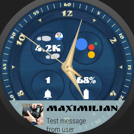
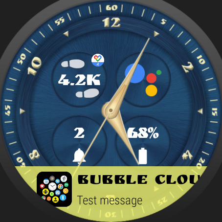
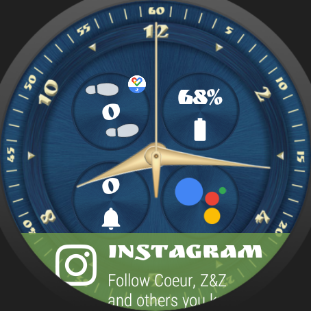
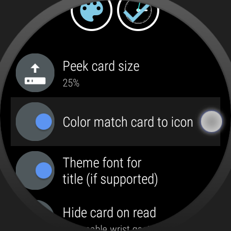
- Consistent automatic peek card colors for apps with all white icons [tip: Primo De Leon] – long press peek card to enable:
- Fixed a problem restoring themes with components from a theme pack matching the sample theme (Pack #0)
- Library update: slightly smaller watch APK, bigger phone APK
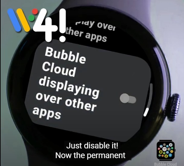
- Preparation for banner ads (only for new free users as alternative to one time payment – Premium and even existing free users will never see ads)
Beta 1
- Fixed a problem restoring themes with components from the theme pack where the sample theme (Pack #0) is from, but they are not the sample theme
- Fixed crash when making backup on older (Android 4.x) devices
- Clock font size was not stored correctly in custom themes
- Updated custom theme related warning “Missing/corrupted data” to suggest to check for app update in Play Store in all 11 languages
Beta 2
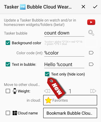
- new Tasker plugin option “Text only (hide icon)” when adding text to Tasker bubble
Works both on the phone’s home screen (widgets/folders) and on the watch (watchface/app drawer/folders/tile).

- Tip: when setting text via %variable, icon will be hidden if resolved string starts with ‘_’ underscore character (i.e. leave option unchecked if you want to control the icon visibility using %variable)
- Thank you to Rohan Shanbhag for suggesting this option!
Colors
Normally the option “Color match card icon” will take the primary color from the icon, and use it to tint the peek card. This works well for apps which use the contact image. But some apps don’t do this, and for multiple messages they usually use a monochrome app icon. Earlier this produced white cards for most notifications.

- first letter controls the amount of blue
- second letter the amount of green
- third letter the amount of red
As you will notice I worked out an algorithm that works for any app and card label, but produces close to the standard colors for many apps:
- blue color for “Tel” (Telegram)
- red for “Gma” (Gmail)
- green for “Han” (Hangouts)
- dark blue for “Fac” (Facebook)
- purple for “Vib” (Viber)
Other apps are generated some random color, but at least you will be able to differentiate them at a glance. See some examples at the right →
Please test and report any issues
I give this version now into the hands of beta testers. You are the first to enjoy these new features, but in return for the early access I ask you to report any problems you find:
- crashes, hangs, regression issues (especially if they are reproducible)
- operation problems (unexpected behaviour, mistakes)
- grammatical errors in text
- layout color / visibility / alignment problems (it helps if you include a screenshot)
- illogical or missing functionality
- further improvement suggestions
Thank you for your help!
See: become a beta tester

