Version 8.72 → Play Store
Slow roll-out: to get it right away join the beta test: http://bit.ly/bubbeta
► Homescreen widget/folder configuration screen overhaul
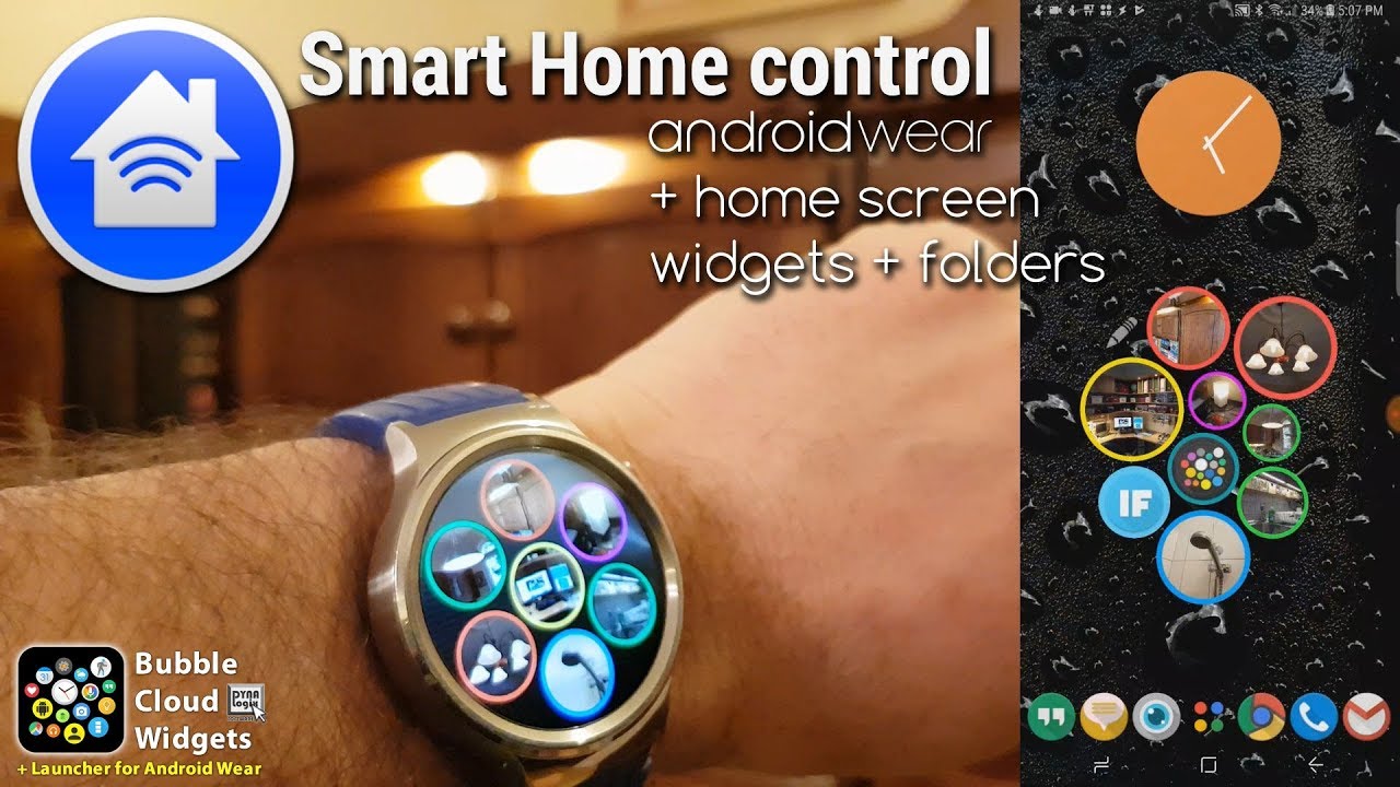
► Smart Home Control HTTP Bubbles on the phone too
► On/Off fields in HTTP commands: 1 bubble → multiple actions
► Drag/resize Bubble Folders on phones/tablets
► Add/remove/edit contact bubbles on the watch (+change image!)
IMPROVEMENTS
► Improved HTTP command history
► IFTTT Maker Event template
► What’s new menu item on watch
► Removed radio buttons from selection dialogs
► New HTTP bubbles get random background color
► Seconds hand is automatically turned on the first time you select an analog theme which includes a seconds hand [Anthony Padgett]
► Reduced complication text size to fit bubbles better [Anthony Padgett]
► Switched to using jobscheduler on the watch (less precise but recommended / required by new Android) → increased sampling frequency
► Keep wear contacts screen on for twice as long on the watch
BUG FIXES thank you for reporting bugs
► Unread / total notification count LiveInfo bubbles were interchanged on the watch [+An Vuong]
► Battery charged alarm did not go off if there was not watch-battery bubble on the watch [+Hilary Adams]
► Custom icons got mixed up when editing bubble in Wear Cloud Editor (bug presented itself after Icon pack was applied)
► Contact picker had duplicate items if multiple groups were selected
► Wear contact cloud did not always sync to watch → now pressing the update/sync button will sync + show the contact cloud on the watch
► 2 crashes corrected in Wear Cloud Editor
► Crash when app needs to be updated but Play Store is not available on phone
► Crash in Wear Cloud Editor related to World Clock bubbles in custom layouts
► HTTP command address field acted strange while typing
► Attempt to fix default watch hand updates on watch
► Fixed bug with complication bubbles in custom watch face layouts
► Crash in Forced-timeout on Oreo devices
► Rare crash while fetching location for sunset/sunrise
► Rare crash when opening Favorite/Archive settings on watch
► Rare crash when opening Settings on watch
► HTTP Link bubbles did not work in embedded watch app
►Workaround for Android permission bug when calling Tasker [Geoff Mackintosh]
WIDGET CONFIGURATION OVERHAUL [Samuel Nogradi]
► NEW FABs (floating action buttons) in cloud configuration screens: new way to add folders, tasker bubbles and new: HTTP command bubbles
► Default group in icon picker shows all apps on phone. The ones already in the cloud are now marked
► Tap icons in icon picker to toggle them (add + NEW: tap again to remove!)
► Removed option “Edit after add” (you can now double tap on icons to edit their bubbles)
► Tap and hold (or double tap) icons in icon picker to edit their bubbles (size, image, colors)
► Add all button moved next to the category dropdown, and it is hidden until low enough number of bubbles are shown to be added together
This has been long overdue. The old FAB (floating action button) looked atrocious and having the “Add all” button as FAB also made little sense, since it could not be used unless you narrowed down the number of icons so they would all fit in the bubble cloud. As more and more things can be added to the bubble clouds, it’s better to use the FAB:
► Tasker bubbles
► Folder bubbles
► New: HTTP Smart Home Control bubbles (coming soon!)
I keep the old buttons for Tasker and Folder bubbles for backwards compatibility. And we still have the “Add All” button too, but it has been moved next to the category drop down – and it only shows if/when it can be used.
I used to get the question how to remove bubbles from a widget. Of course you can tap on the the pencil, then on the bubbles in the widget and use the trash can in the Bubble Edit dialog. But now there is hopefully a more intuitive way:
On the screen where we add bubbles, we can tap added bubbles to remove them. This Cloud Configuration screen now highlights all the bubbles already in the cloud. We used to be able to tap multiple times on a bubble to make it bigger. Now long pressing the icons will bring up the Bubble Edit dialog and you can adjust the size of the bubble (double tapping does the same for compatibility: if you are in the habit of tapping on bubbles multiple times to make them bigger, the sizing dialog will let you do just that). The long press of the icons used to show the app’s name. It’s displayed in the Bubble Edit dialog now, and you can press “Delete” (or the trash can) if you don’t want to add the item to the bubble cloud. Of course the same options work with Contact Bubble Clouds too.
WEAR CONTACT CLOUD
As a consequence the Contact picker got updated for the Wear Contact Cloud too. We can now:
► remove bubbles from the watch using the phone (earlier you had to press the trash can on the watch)
► change the size of the bubbles (press and hold to edit bubbles)
► change the bubble colors and images (to imported / cropped images or icons from icon packs)
…these were all not possible before.
I also did a little facelift for the overall Wear Contact Cloud experience, both configuration and use is a bit more streamlined.
HTTP TOGGLE FIELDS
This is big! You can have one bubble send multiple variants of the same command. Typical use: one bubble to turn something on and off. How?
You can now place toggle fields into any part of the HTTP command (address, header, POST data). The field has the format [1|2|3] this is going to be replaced with one of the listed items cycling through the alternatives. Example:
Say you have two commands:
► http:// 192.168.100.52/lamp/switch/on
► http:// 192.168.100.52/lamp/switch/off
Now you can have just one bubble with the command:
► http:// 192.168.100.52/lamp/switch/[on|off]
The app will alternate issuing the two variants
You can have as many alternatives as you want (cycle through different colors or dim levels!). And you can place as many of these fields in the command as you need. They will be cycled through in sync (as long as each field has the same number of item alternatives).
Note: Uncheck this option if your command includes the characters [ , | , ] Then the toggle field cannot be used. Please tell me if you run into this, I can add alternative toggle field characters too.
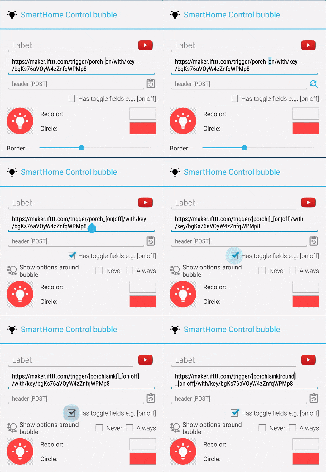
Convenience: Place the cursor where you need to have the field, and enable the option → an empty field is inserted to the cursor location. This makes it much easier to type these hard to access characters on the phone!
See the attached video for a demonstration of these on/off toggle fields.
Big shoutout to kind users whose names are in [square brackets] following certain features and reported bugs. They are essential to the success of this app! Thank you!
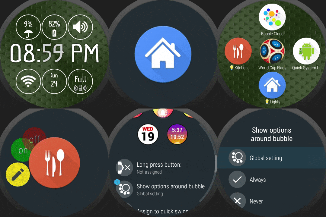
SMART HOME BUBBLES ON WATCH → see 1st animation
► Toggle options now also show on the watch
► New option in SmartHome bubble edit screen on the watch: show options always/never/follow global setting
► New expert setting on the watch: global control whether to show toggle options for SmartHome bubbles
► Updated the default Smart Home bubble image
EDITOR FEATURES → see 2nd animation
► “Pro” feature in the SmartHome bubble edit screen (on phone): long press checkbox to insert “|” character between [ ] and more “[ | ]” fields (otherwise it’s pretty difficult to type these characters on soft keyboard)
► If there is selected text, inserting a toggle field will add selection as the first toggle option (and place cursor where the second option goes) → see 2nd animation
———————–
Detailed change log: http://forum.xda-developers.com/general/paid-software/app-bubble-cloud-widgets-applewatch-t2898592/post56270161#post56270161
As you can see, ton of new things added, the app is being developed actively. If you find any bugs or crashes, please contact me so I can fix as soon as possible.
★★★★★
THE PROJECT NEEDS YOUR HELP
My app is getting an increased number bad ratings lately. If you like the app and the progress please support the project with a 5★ rating. It helps tremendously: https://play.google.com/store/apps/details?id=dyna.logix.bookmarkbubbles
Thank you!
★★★★★
#tasker #aw20 #standalone #androidwear #moto360 #hwatch #zenwatch2 #lggwatch #sonysmartwatch3 #sonysw3 #lgwatchurbane #watchfaces #watchface #HuaweiWatch #LGUrbane #Smartwatch3 #zenwatch3 #androidwear2 #complications #remap #button
#widgets #theming #personalization #novalauncher #launcher

