Logic behind the new setting structure
The convoluted structure of the phone app was the result of a long evolution since the earliest versions of the app in 2014.
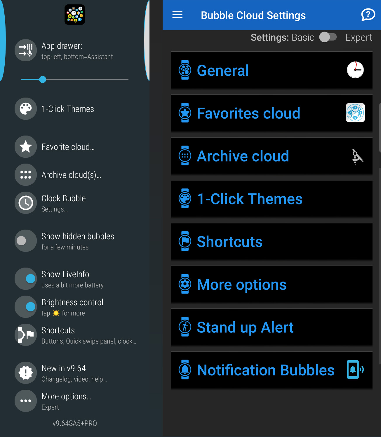
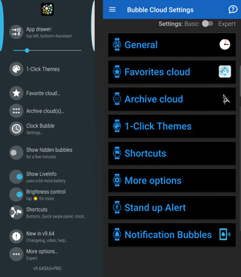
In 2017, with the introduction of stand-alone watch apps in Android Wear 2.0, I made all the settings available in the watch app. Their new layout greatly benefited from the insight I gained during the first years. Instead of grouping settings by use-case (app-drawer mode vs watch face mode), their organization was based on the clouds and bubbles the various options affected: favorites, archive, clock bubble, 1-click themes etc.
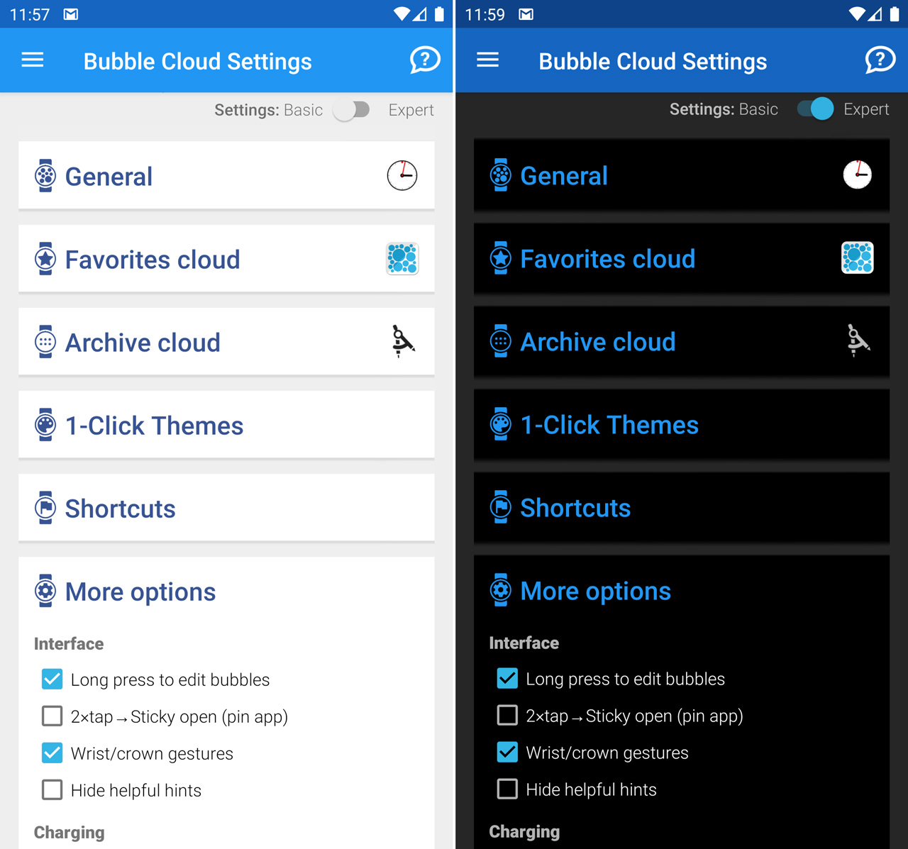
Version 9.64 brings this same structure to the phone app:
- General – Basic options
- Favorites cloud / Watch face
- Archive cloud
- 1-Click Themes
- Shortcuts
- More options
Version 9.64 changes
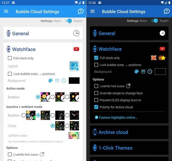
- System dark mode (Android 10 and some Android Pie devices)
- Settings are grouped more similarly to the watch app: General, Favorites, Archive, More options
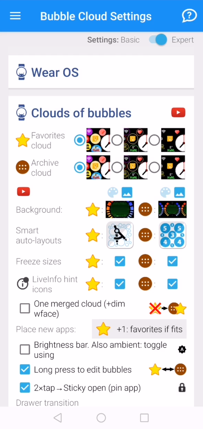
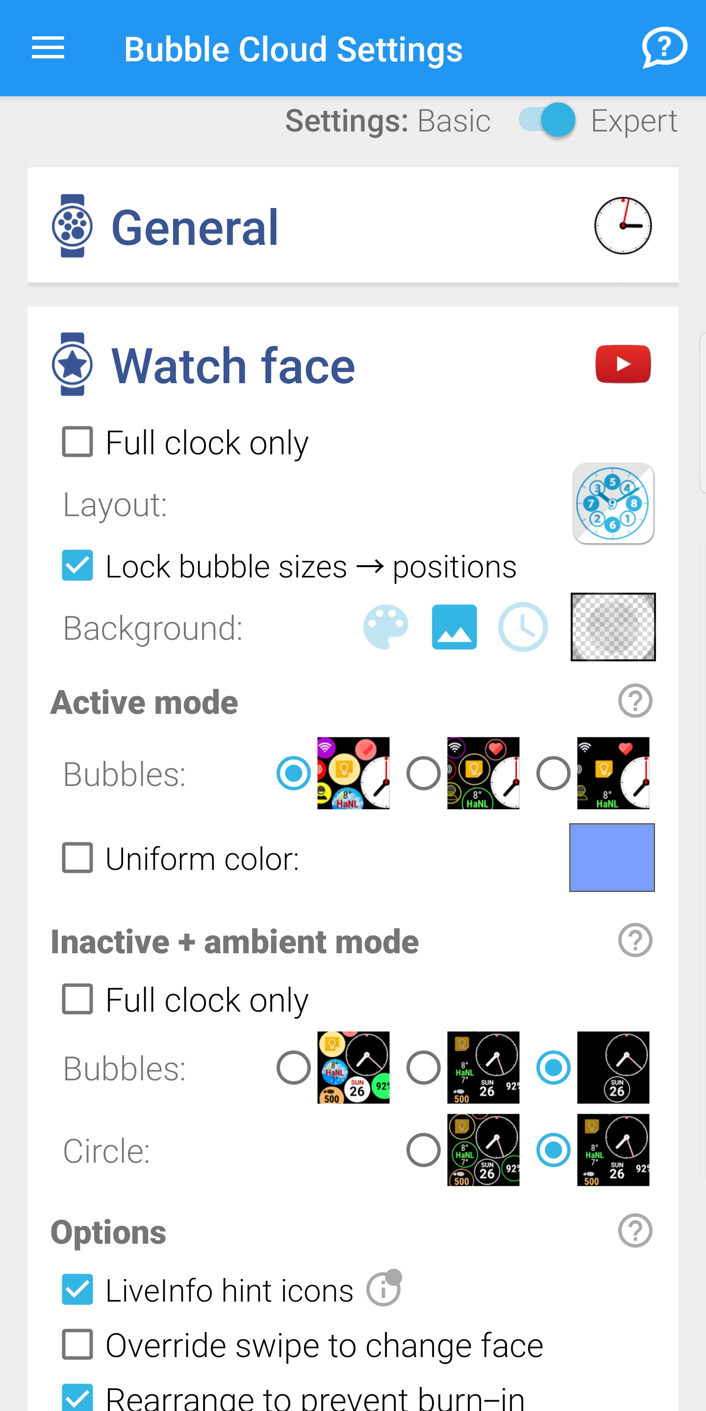
- Unused settings are hidden (app drawer options in watch face mode and vice versa)
- Many cryptic option names made clearer now
- All outdated (Android Wear related) messages were refreshed
- New ⓘ (“info”) hints point to posts in app’s website (often replacing the old youtube links)
- Missing option added: vertical app drawer (it was only available on the watch)
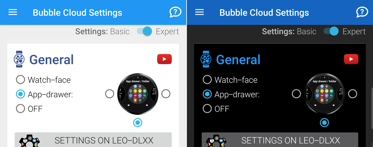
- All settings became more airy and more “standard” looking (with descriptive section headings)
Before After - Each group now has a different “cute” watch-icon (all used to be the same icon)

Here is another screenshot (“Full clock only” enabled in dark mode, causing some of the controls to hide)
Other changes in beta 2:
- quicker access to Wear Cloud Editor using the shortcut icon in the “Archive Cloud” group:

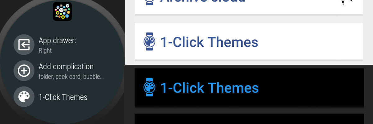
- 1-click themes symbol is now the “paint palette” everywhere in the app
- reduced watch app size by 7%
- date bubble dialog was broken since v9.54 (accessible by tapping on the date bubble in the Wear Cloud Editor)
- Floating action buttons sometimes did not fit in landscape orientation
- New way to select “Background color by minutes of the hour” (similarly to the way on the watch)

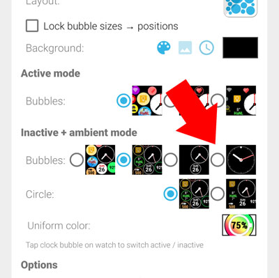
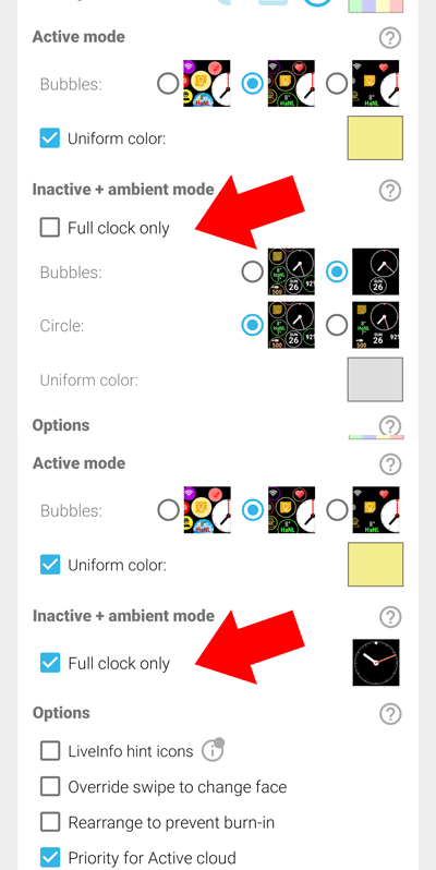
- New way to select full-clock-ambient: use the separate checkbox
Before (see 4th option) After (separate check box)
Please report any issues!
This update (especially the dark mode) affects every part of the app – including the home screen widget screens. Please send me a screenshot if you see something off!
It would be a great help, if those of you with Android 10 devices (and night-mode capable Android Pie devices) could test Bubble Clouds in Night Mode.

