v5.13: submitted to the Play Store
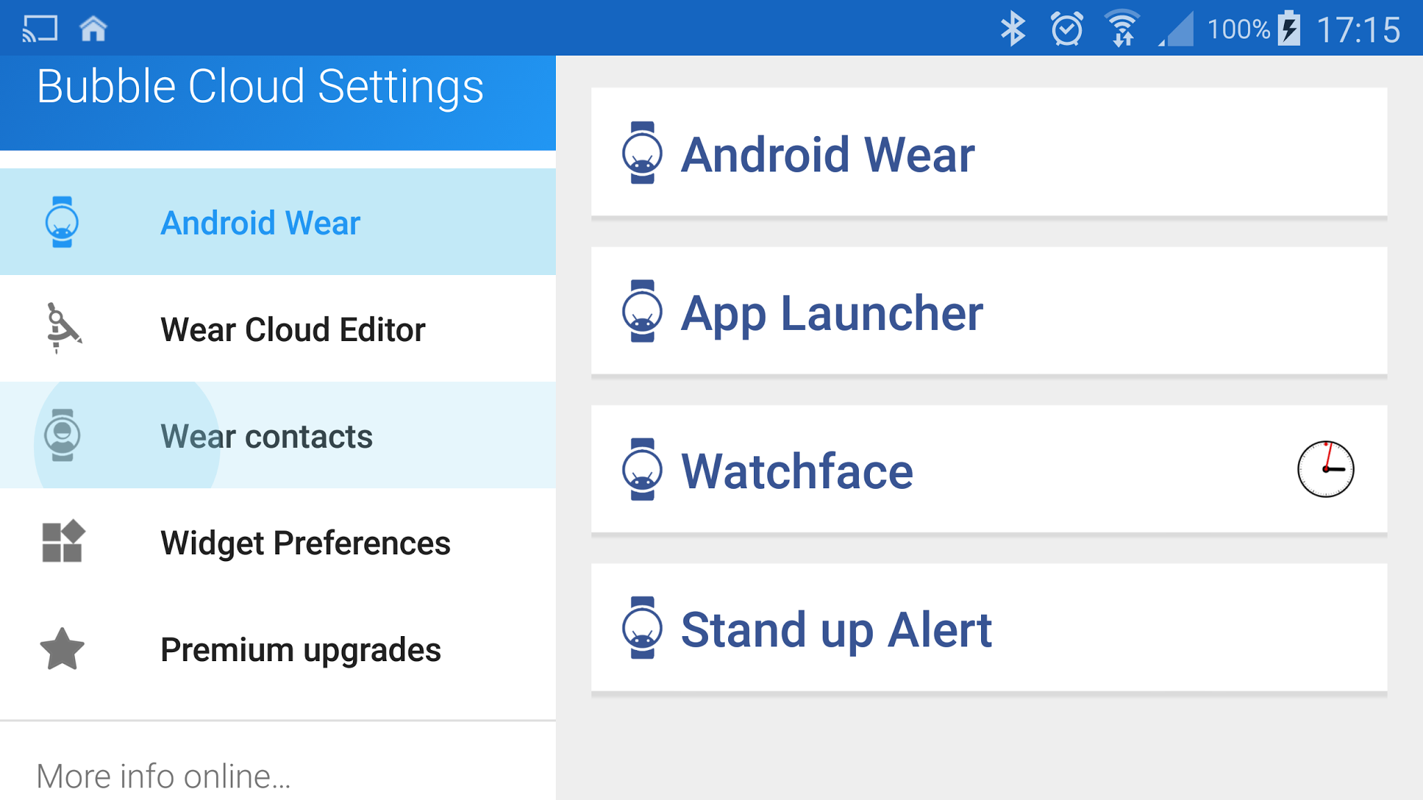
►”Wear contacts” is now a navigation item (was card)
►Changed settings symbol to app icon in widget edit control bar (takes you to the main app)
►new hidden function: long press ⊕ button in widget control bar to measure widget + turn on animation
►options to disable clock bubble double tap / long tap functions (voice search / full screen clock)
►optimized my code to make the APK size smaller than v5.09 even with the added functionality
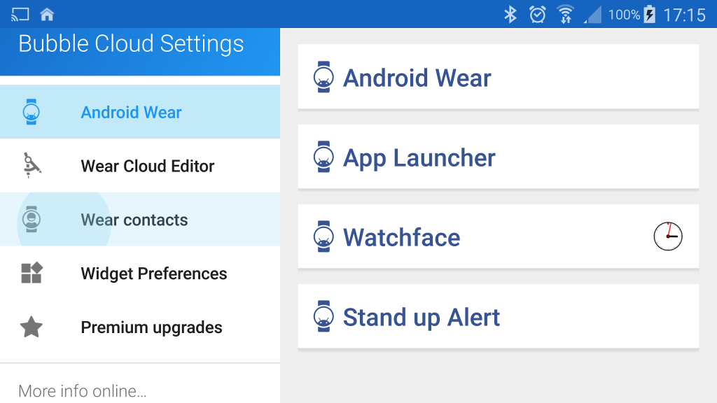
NEW NAVIGATION ITEM: WEAR CONTACTS
I’ve been planning this change for a while. It was extremely awkward to access the Contact settings for the watch:
►used to be one of the cards, which had a button
►if you clicked the button it opened a dialog
►in the dialog you had a button
►which took you to a new screen
►where you had to press a button to add contacts
I hope the new arrangement is more logical: click the “Wear contacts” navigation item and everything related to the Wear Contacts are there:
►Add contacts
►Adjust settings
►Authenticate Gmail
►Resync with watch
►Remove all
No other functional change, just cleaner access


