What’s new in beta 6?
- The video above, now linked into the app
- The main clock bubble in grid layouts now appears above or to the right of the cloud (the video thumbnail above shows an example of this) If you want more control, place two separate widgets
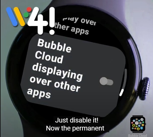
- Convenience: bubble sizes will now automatically be locked (and “move to center” is also disabled) after using the swap tool – otherwise the cloud would be rearranged. Note: no locking if you use the swap tool to move bubbles from one widget to another
Smaller improvements
- Layout issues in the clock widget selective apply screen
- Crash after adding a folder shortcut (using the Widgets+Folders screen)
- Import image did not work when changing folder shortcut icon
- Ads will no longer show in Pre-launch tests
- Link clock settings to online help
- Slight layout glitch in clock widget settings (misaligned square/round switch)
Wear OS
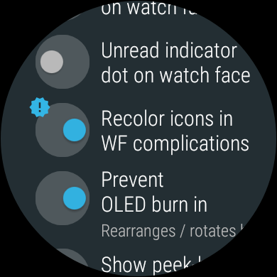 New expert option on watch: do not recolor watch face complication icons (only affects classic bubble cloud layout, standard Wear OS layout complications will stay recolored)
Normally complication icons are supposed to be single-color to be tinted to match the style of each watch face. AutoWear for Tasker however allows you to create color icons, and with this setting these will appear full color on the Bubble Cloud watch face. [Tip / request from Andy Wiener, thank you!]
Transcript
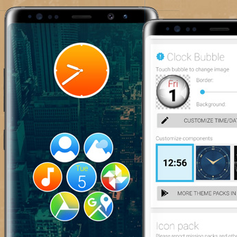
Bubble Cloud Widgets received yet another big update: now we can add clock bubbles.
I also improved the bubble folders and overall compatibility with misbehaving launchers.

The quickest way to add a bubble clock is to create a widget the usual way.
Choose from a hundred different analog and digital themes, available from free and paid theme packs.
We'll pick this and simply click the checkmark. That's it!

So we can have a dedicated clock widget, but it can also be a part of a cloud of bubbles.  Double tap to customize it.

Let's first choose this "Bolt" icon pack, then use the yellow plus sign to add a few bubbles.
Sorting alphabetically helps you find the bubbles you want.  You can also search at the bottom of the screen, or long press bubbles to see their names.
The clock will be the main bubble, which means it will stay to be the biggest and take the main place in the cloud.
Even as we resize the widget, or change the cloud layout.
No matter how we arrange the cloud, this clock bubble looks very much out of place, don't you think?
We can change it!

Notice the theme chooser is still available, but when we pick a theme, now we can also choose which part of it we want to use!
I mark the clock hands from this theme and press apply.
From another theme we take the dial, but notice, it's not the right color.
I am using the brightness control to make these dial-dots white.
We are getting there, but what about the background texture?
Well, we have a lot of options for that!

For those we click on the preview. Here we can customize the 3 layers of the clock bubble.
When I tap the backdrop, I can choose any icon from the active icon pack, let's search for a cool image for the clock.
Another option is to use part of your own images, via the import image button at the bottom. Do you want a death star clock?  You can crop a circular or even square part.

I left the best for last: if the icon pack has masking information for missing icons, that same masking can be applied to the clock bubble.
This way the clock bubble will fit perfectly with any icon pack!

There is more! I show you how to add a date bubble.
We can have only one main clock, but we can add as many time/date bubbles to the cloud as we wish using this floating action button.
The system is exactly the same. We choose an initial theme, then we can modify it to match the style of our bubble cloud.
Since this bubble has text, we can customize it too using the "Time/date format button"
This is where you can change what is shown in the 3 text areas. The bottom part of the screen provides controls for color, size and font style.

The newly added date bubble blends into the cloud so well I dare you to spot it. Okay, it's here.

Time to move the widget on a new page, where we have space for it to expand more.
One final touch: let's use the swap tool to move the date to the middle. Great!

I promised you folder improvements in the beginning. Let me set this up.
What if you'd like a cleaner home screen with bubble cloud as a pop-up folder instead?
Even though I removed the widget, when prompted, I make sure to choose to save the orphan cloud for later use.

Bubble cloud folders are created in a similar manner to widgets, but after I draged the folder icon to its position on my screen I now get to specify the icon.
Just as before, we could crop from any image in our gallery, but I will just use the drawer icon from this pack.
The very first time I press this shortcut, I will be prompted to either create a bubble cloud from scratch, or restore the one we've just removed.

By the way, this is the way you can update the folder icon later. Just remove the old one, place a new, and restore the cloud.

One last important addition in this release.
If your launcher doesn't show the bubbles correctly, there is now a new way to calibrate your launcher.
For the example's sake I now switched to the notorious Microsoft launcher.
The world of launchers on Android is still much like the wild west.
Few launchers are fully compatible with the specifications,
and if the launcher reports the wrong size to Bubble Cloud, the bubbles in the widget will appear distorted or not even at all.
The cloud appears, but with a lot of layout issues.
Look at the text in the date bubble, or the increased space between the bubbles.
Now we can fix it. Triple tap on the widget to get to the cloud configuration screen, where we use this repair tool and the "Calibrate launcher" button.

The dark rectangle in this special view shows us what the widget shape should be.
And the lighter rectangle shows what the launcher is actually reporting.
Notice how different these two shapes are. The launcher is reporting the wrong dimensions.
As we use the gray arrows to move the yellow puzzle piece over the black one, light rectangle will cover the dark one.
We are aiming to match the two rectangles as perfectly as possible. The opposite arrows move different amounts, so you can press several times for fine adjustment.

Very very important: if you cannot match the two rectangles perfectly, it's better to have a little bit of the dark rectangle to show than the light one!
A thin dark frame is okay, but make absolutely sure not to have any light frame left!

Good news, this only needs to be done once. And all your current and future bubble clouds will appear flawlessly.
Please support this project by liking this video and subscribing to my channel.
I started to work on this app in 2014. After 6 years I am still adding major functionality.
If you haven't yet, please balance out the recent flood of negativity in the Play Store reviews with your 5-star rating.
Thank you for all your support, and keep enjoying the bubble clouds!