BEHIND THE SCENES
Let me share my test grid, these are all the different watch screen-modes I will test before every release starting v4.42. Crazy number of combinations, each with their special behaviors:
►each mode needs to be tested both in “A”mbient and “B”right mode
►except of course the app drawer, where there is no ambient currently
►ambient mode usually needs to switch from color to black, but not always: Moto 360 users like colors on their ambient screens too
►the mode I call “No icon” is actually “No bubble” 🙂 but there is a case when it should draw a color circle around the clock: when background color by minute of the hour is enabled…
►the clock only mode has been updated now to also show selected bubbles such as the date, battery, steps etc.
►analog and digital clock faces are implemented differently the digital clock being the most battery friendly of the two
Bubble Cloud Widgets + WearOS Tile Launcher / Watch Face
Place apps, contacts and bookmarks in Apple Watch style "circle galaxy" on the launcher homescreens or Android Wear watch
Public interest
Support This Project
If you like what I do please support me on Ko-fi
Recent posts
 Podcast episode about Bubble CloudsWhat are the key benefits and drawbacks of using the app on both Android phones and Wear OS smartwatches…click for more!
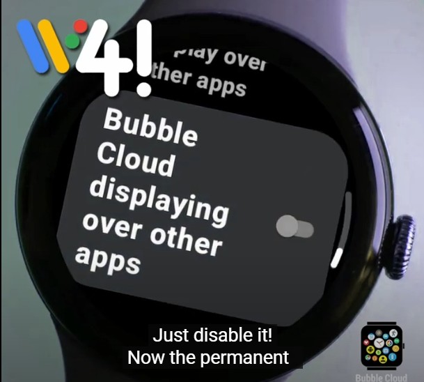 Is it still possible to hide the permanent overlay notification on wearos 3 or 4?Yes and no. In the emulator Wear OS 3 and 4 works like this. Mobvoi TicWatch Pro 5 and updated TicWatch Pro 3 keeps this user-friendly operation 👍. Only Pixel and Samsung watches are user-hostile 😈…click for more!
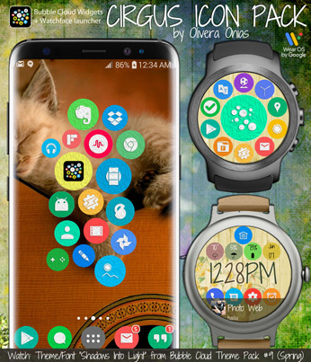 Cirgus icon pack…click for more!
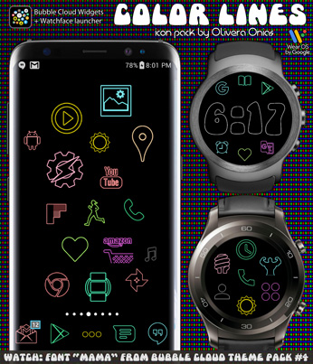 Color Lines icon pack…click for more!
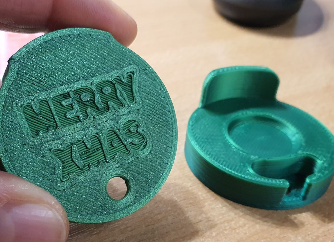 Gift a TicPuck to a loved one (or even to yourself!)Never misalign the TicWatch charger again → downloadable STL, or if ordered within EU includes free holiday edition with "Merry Xmas" printed on the bottom…click for more!
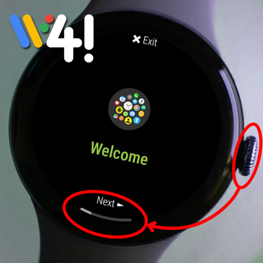 Stable v10.27.4 update for Wear OS 4 Pixel & GalaxyWe finally passed Google's more rigulus Wear OS approval process, we are amongst the shrinking number of approved apps allowed on the platform.…click for more!
Archives
Support This Project
If you like what I do please support me on Ko-fi
Copyright © 2026 Bubble Cloud Widgets + WearOS Tile Launcher / Watch Face

