A little history
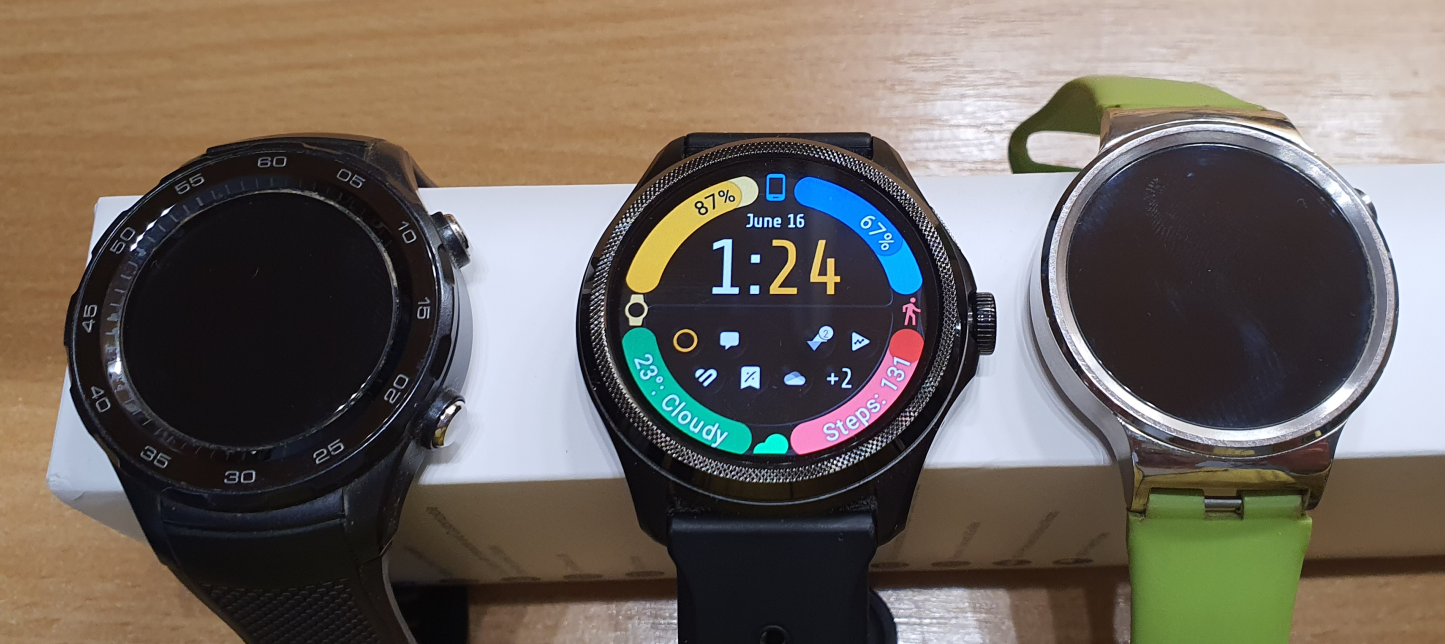
I was very excited to get the newest TicWatch Pro 5 watch from Mobvoi because I had only had good experiences with TicWatches. Over the years, I had the opportunity to try and use many Android Wear / Wear OS watches:
Moto 360
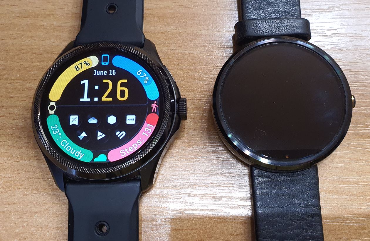
Starting with the Moto 360 in 2014, I immediately embraced the idea of having a streamlined, yet powerful version of Android on our wrists. The original Moto 360 is still considered one of the best-looking smartwatches, despite its “flat tire” design, which was necessary to achieve thin bezels at the time. What I couldn’t live with was the atrocious, 12-14 hours “full work-day” battery life due to the undersized battery and backlit LCD screen technology that lacked battery optimization. The battery life became even shorter when all features, such as raise to wake and always-on display, were enabled. Nevertheless, it was a remarkable start, with features like the Google Now feed, the peek card system, and the Google Now assistant making it very appealing.
Huawei
My next two watches were from Huawei, which were still running Google’s operating system at the time. The Huawei Watch 1 was the first watch to receive the second iteration of the Android Wear operating system. Unfortunately, this update took a step in the wrong direction: Google abandoned the Google Now feed (interestingly, Apple is adding something similar to their watch in 2023, which makes me wonder if Google will revisit the idea of assistant feeds now that Apple validates it). Even worse, with Android Wear 2, Google gave up on peek cards and replaced Google Now with the less capable Google Assistant. Google Now could converse in over 60 languages, while the new Assistant was much more limited. On the positive side, Huawei succeeded in providing beautiful hardware with OLED screens and better-sized batteries, resulting in 40-48 hours of battery life even with all features enabled. The Huawei Watch 2 improved on this, but it came with a smaller screen and a more controversial aesthetic. Nevertheless, Huawei watches running Wear OS have always been feature complete, offering microphones, speakers, reliable heart rate sensors, light sensors, Wi-Fi antennas, and even standalone phone options that were lacking in many other brands.
Mobvoi
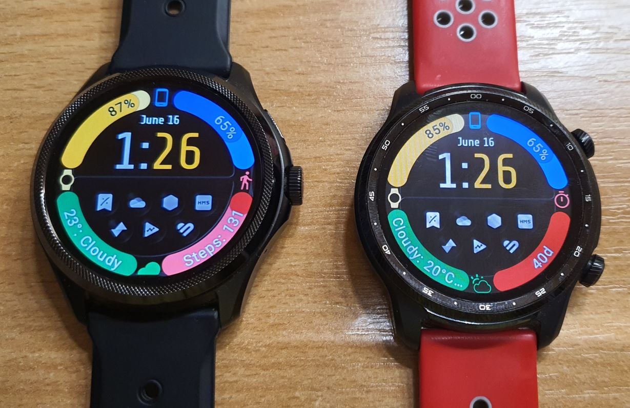
When Mobvoi announced the TicWatch Pro 3, it immediately caught my attention. I ordered it on day one. I found this watch to be a worthy successor to the long-lasting battery and feature-complete Huawei Watch 2, but it surpassed it in many ways. I was amazed by the true 3-day battery life with all features enabled, achieved through their double display technology. The FSTN screen had additional advantages such as higher visibility in direct sunlight and an incredibly long 45-day “Essential mode” on a single charge. The TicWatch Pro 3 had a larger screen, more powerful processing, and more sensors than any of my previous watches.
Samsung
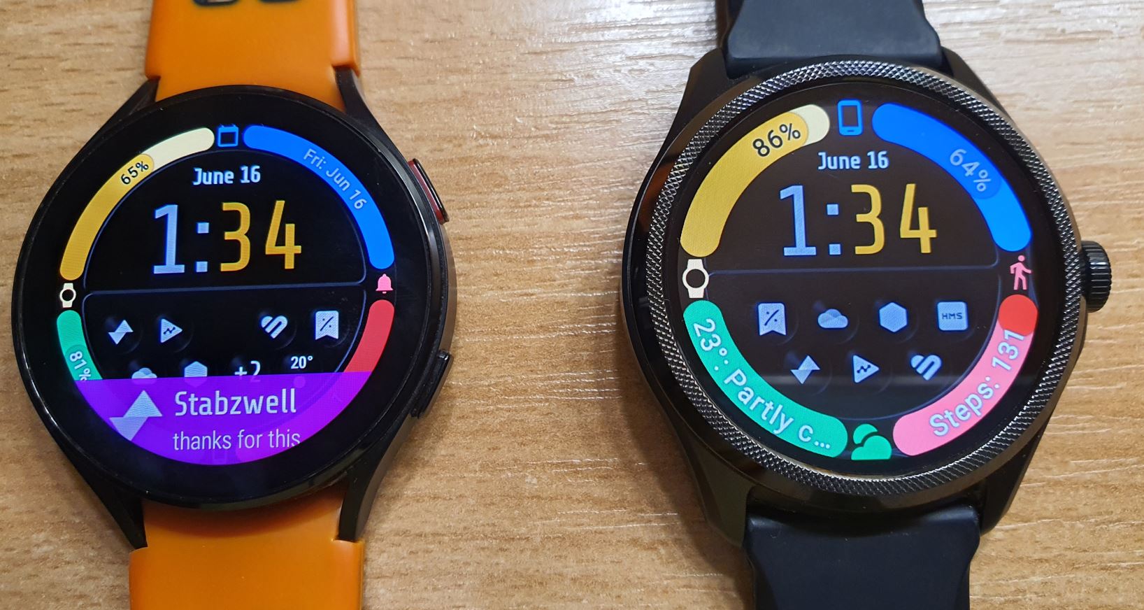
When Samsung re-joined Google’s watch OS, I had to try their offering, the Galaxy Watch 4. Even though I opted for the larger variant with a slightly bigger battery, it still fell short of the true 72 hours of battery life that my TicWatch Pro 3 was capable of. So, despite the Galaxy Watch 4 having more accurate sensors, the convenience of wireless charging, and exclusive software like Samsung Health and the newest version of Wear OS (3), I often found myself wearing the TicWatch Pro 3 simply because I trusted it to last through a busy weekend more than the Samsung watch.
LTE
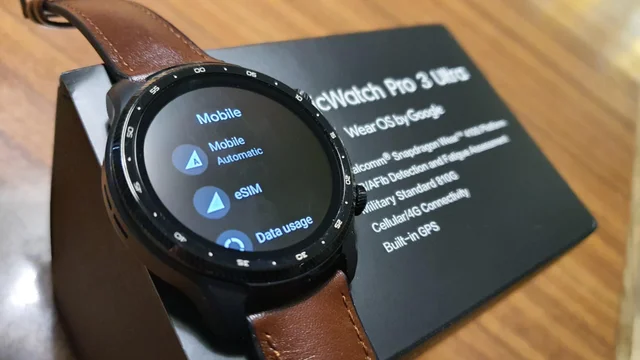
I may have considered whether the TicWatch Pro 3 Ultra had enough improvements over the previous year’s non-Ultra model that I owned, but when its LTE variant was released, I couldn’t resist. Gaining independence from my phone made all the difference. You will find my post on how I set up LTE on the Ultra (mirror) even in a country that is “officially” not supported. Being able to leave my phone at home and still make calls, payments, access notifications, use the assistant, and look up information is tremendously liberating. In my opinion, the TicWatch Pro 3 Ultra is the only Wear OS watch (or any smartwatch, for that matter!) capable of doing all this with a practical battery life. To achieve LTE capabilities and still maintain a full 24-hour day of independence with room to spare, you need a 600mAh battery and extremely power-efficient screen technology in a watch.
TicWatch Pro 5
With this we arrive to the TicWatch Pro 5. Why did I upgrade, and will I keep it?
I decided to upgrade to this watch because it brings significant improvements over the TicWatch Pro 3 Ultra:
Hardware
Battery
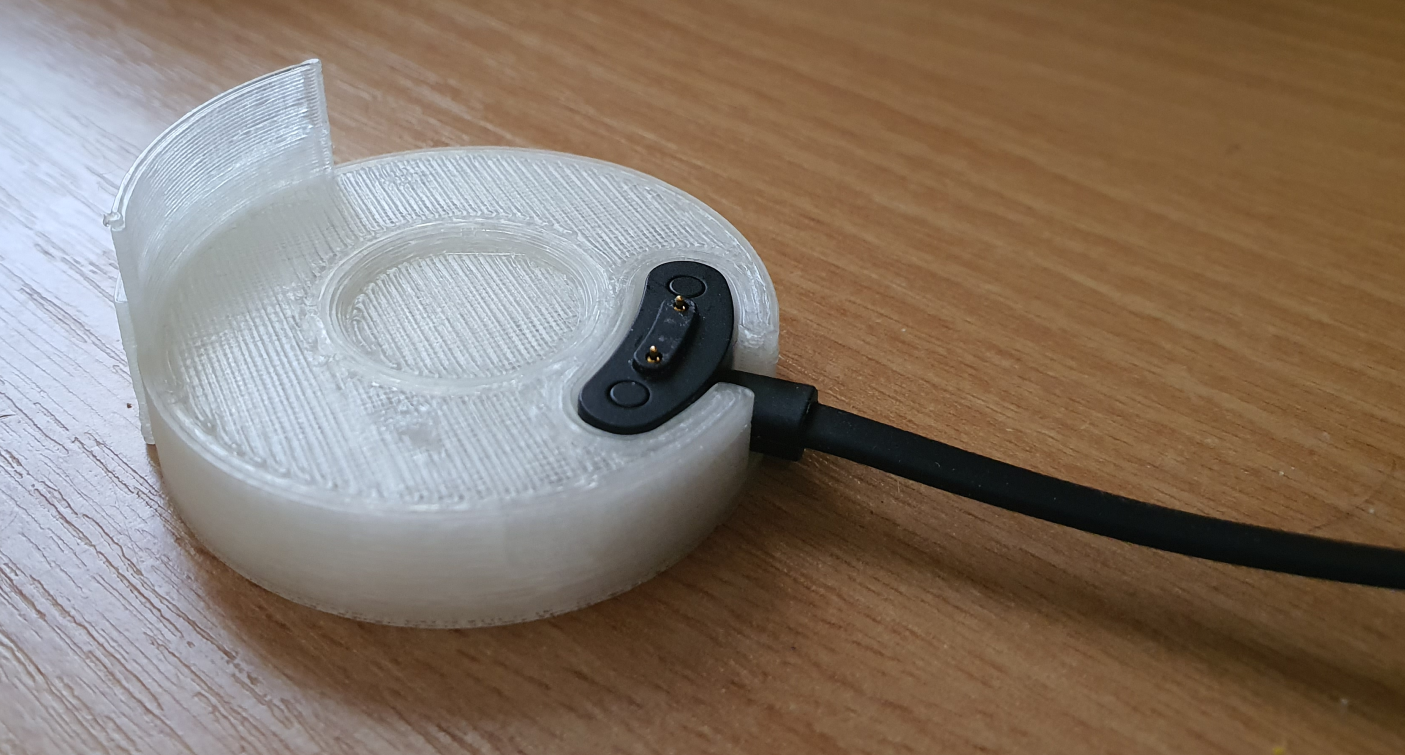
The battery life is even longer than before, which is hard to believe! Mobvoi not only improved battery efficiency with Qualcomm’s new 4nm SoC, but they also increased the battery capacity, solidifying their position as the Wear OS battery champion. Having a large enough battery provides a tremendous advantage for worry-free use and maintaining good battery health. These devices can be expected to last for many years because we no longer need to completely drain and charge the battery. Battery science tells us that fully draining and fully charging a Li-ion battery wears it out the most. With my TicWatch Pro 3 watches I got into the habit of only charging the watch to 80% (this app feature helps me with that). Even starting from 80%, the watch wouldn’t drain much below 40% by the next day. This gives me peace of mind without wearing out the battery.
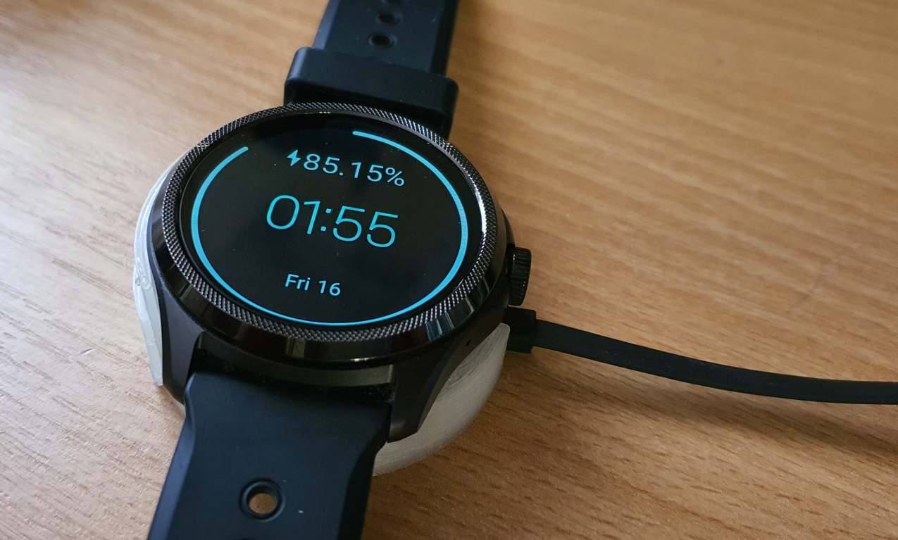
If charged in this manner, even my TicWatch Pro 3 only took 20-30 minutes to reach 80% charge. However, the TicWatch Pro 5 surpasses even this. With its larger battery, I often start charging from 45-50%, and it charges much quicker. I found that a 10-15 minute daily top-up is enough. I had to speed up my shower routine! I also appreciate the new charging screen that displays fractional percentage values while charging.

Body
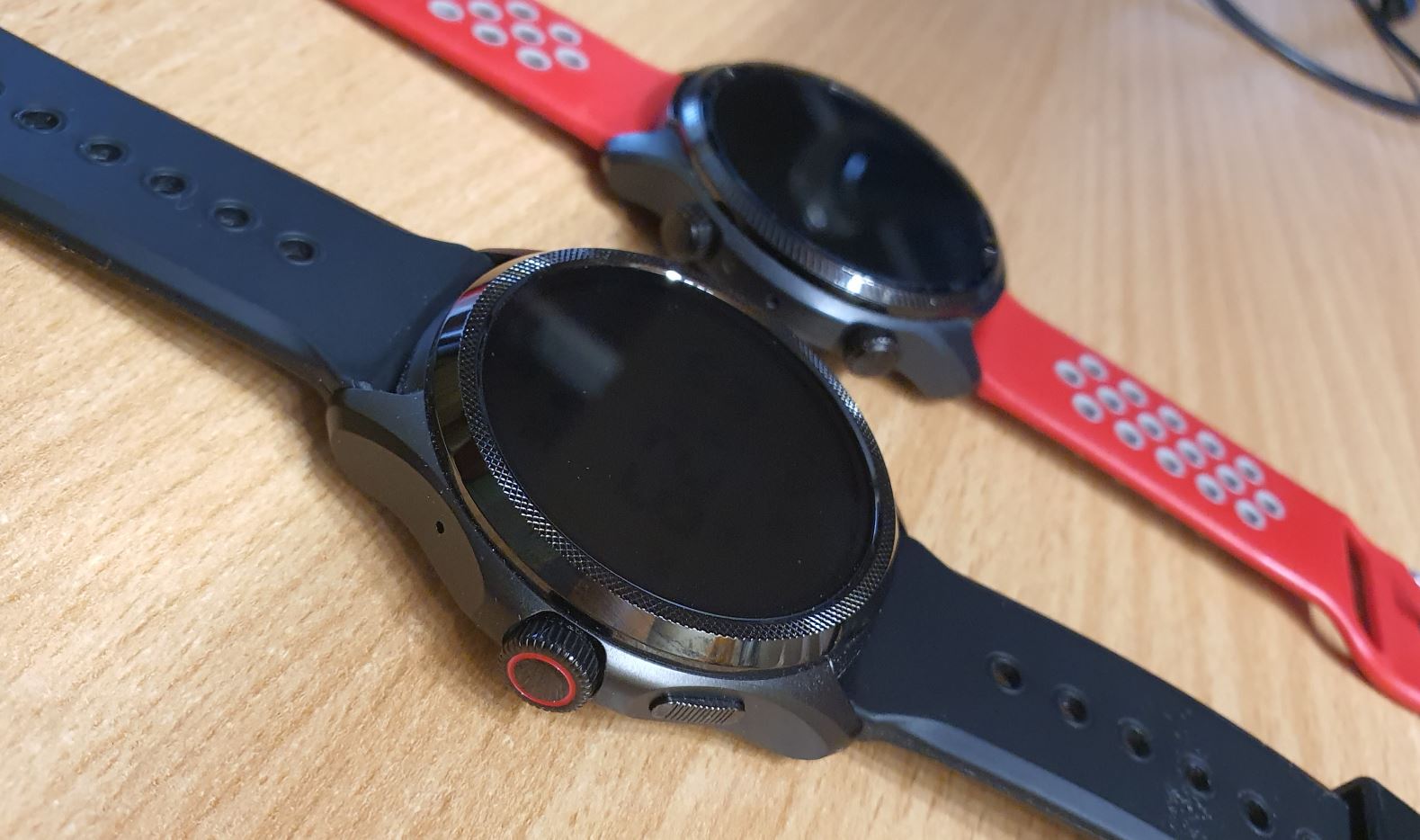
I already liked the direction Mobvoi was taking with the style and design of the watch with the Ultra variant. Switching to a metal case and removing the dial marks from the bezel makes the TicWatch Pro 5 even more attractive. It’s a little unfortunate that they also changed the band size, but to be honest, the wider 24mm bands look more proportional on this watch than the narrower bands of the previous models. Being a sporty person, I’ve always used silicone bands, and I’m quite happy with the band that comes with the watch.
Crown
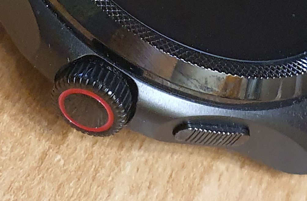
Speaking of hardware, I was particularly excited about the addition of the rotating crown. This was long overdue. Although I must say, it’s not as good as it could be. Mobvoi did their part perfectly, but as always, the problem lies with Google’s implementation. While scrolling is possible in the OS via the crown, Google hasn’t provided any way to make a selection other than tapping the touch screen. Pressing the crown will either exit back to the watch face or go from the watch face to the list of apps. Again, Mobvoi’s hardware is perfect, but Google’s software is a bit underwhelming.
Screen
However, Mobvoi takes advantage of the rotating crown in their own special ways. It is also enabled in the FSTN screen mode! I love how I can have tilt-to-wake enabled and still stay on the LCD screen. By spinning the crown, I can activate the backlight and choose what information is displayed in place of the time, such as heart rate, calories, SPO2, or skin temperature measurements. Whatever I choose will remain visible on the always-on screen during exercise, while the time shrinks to smaller digits in the date area. If tilt-to-wake is disabled, tilting the watch activates the backlight behind the FSTN screen, with its color indicating the heart zone I am in. What a cool idea!
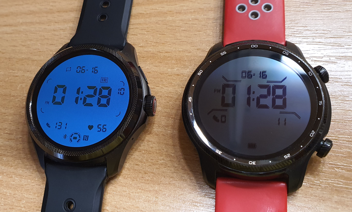
The updated FSTN/LCD display showing health data is great, but are the sensors any good? They have improved. The sensor array on the bottom of the watch looks different from previous TicWatch models. To be honest, I was quite disappointed with the original TicWatch Pro 3. At the time, my Galaxy Watch was the only one I used for exercise and sleep tracking. With the TicWatch Pro 3 Ultra, things improved, although the Galaxy Watch still had some accuracy advantages. I haven’t had the chance to make a detailed comparison between my Galaxy Watch and the TicWatch Pro 3 Ultra and TicWatch Pro 5, but I feel the TicWatch Pro 5 is now on par with the Galaxy Watch in terms of accuracy. It’s a shame that Mobvoi now tries to charge us for advanced sleep tracking. I wonder how many subscribers they have and if it’s worth maintaining the paywall at all. If I want advanced sleep tracking, I can still wear my Galaxy Watch.
Performance
I never experienced performance issues with either variant of the TicWatch Pro 3. They have always been snappy, with no waiting time for apps to load or install. However, the improvement in the TicWatch Pro 5 is noticeable. There is literally no lag or delay in anything. Even side-loaded Android apps like Assistant Go load instantly. The increased RAM allows for quick switching between open apps, and scrolling lists and animations are buttery smooth. Tilt-to-wake is instantaneous.
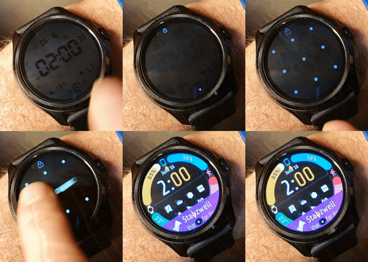
Booting up takes half as long as with the earlier models. This is important because I like the new automatic “Smart Essential Mode.” Yes, we already had Scheduled Essential Mode in the TicWatch Pro 3 Ultra, but the TicWatch Pro 5 improves on this in multiple ways. If you enable this “smart mode,” the watch will not enter Essential Mode until you take it off your wrist or fall asleep while wearing it. Returning to Wear OS mode in the morning is quicker thanks to the faster processor, and another necessary step has become much smoother and quicker: pattern unlock. If we keep the watch on our wrist constantly, we only need to use pattern unlock once when the watch comes out of Essential Mode. On all my previous watches, entering the pattern has always been a struggle for me. It has always been a laggy experience on Wear OS, requiring a few seconds after waking up the screen for it to detect my swipes. I had to draw the lines deliberately and somewhat slowly for all corners to register. Is this a Wear OS 2 vs. 3 thing? I don’t think so, since my Wear OS 3.5 Galaxy Watch still has the annoying lag on the pattern screen. I love how I can now immediately and quickly draw my pattern on the TicWatch Pro 5. It saves me a few seconds every day, which not only adds up but also removes a recurring annoyance.
FSTN
I already mentioned the FSTN screen improvements, but there’s more. I appreciate the updated layout and additional fields, such as the day of the week, NFC, Bluetooth status, and a more detailed battery level. It took me a few years to embrace the FSTN screen because I wasn’t a fan of the dated look of the LCD digits. I still like to enable the Always On Mode of my Wear OS watch face, but for battery efficiency and visibility, I find myself using the FSTN screen more and more, especially as its appearance improves with each model.
Wear OS 3.5, yeah! No?
Is it a significant positive for this watch? I have mixed feelings about it.
We have been eagerly awaiting the OS update for the TicWatch Pro 3 and Ultra for years. It was promised and anticipated since the release of the Ultra. So, even though the previous models have to wait longer, at least the new watch comes with it. But is it worth the excitement? Is not having it on the earlier models a deal breaker?
Apps
On the one hand, we do get some of Google’s new and updated apps that they refuse to release for Wear OS 2, such as the Google Home app and improved versions of Google Maps and Google Keep. The new version of Google Maps is particularly good news since unlike previous versions this one actually works and even utilizes the TicWatch Pro 5’s compass! These are welcome benefits of the Wear OS 3 upgrade, although it’s not clear why Google wouldn’t update the same apps for Wear OS 2.
However, even with Wear OS 3, “Google giveth and Google taketh away”. We have to bid farewell to Google Translate and, most notably, Google Assistant. The TicWatch Pro 5 doesn’t come with a voice assistant out of the box. You can install Amazon Alexa (which I haven’t tried) or sideload Google Assistant Go, intended for low-end phones but can be squeezed onto the watch’s tiny screen. These are potential workarounds, but it goes without saying that neither provides the native Google Assistant experience..
Quick settings
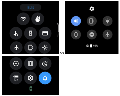
Some of the core functionality of Wear OS has changed for the better, like the improved quick setting panel, which now features 14 icons (including 7 new ones: Wi-Fi, water draining, touch lock, Google Pay, screen brightness, night mode, and battery/essential mode). Additionally, there’s now an “Edit” button for customization!
On the Phone
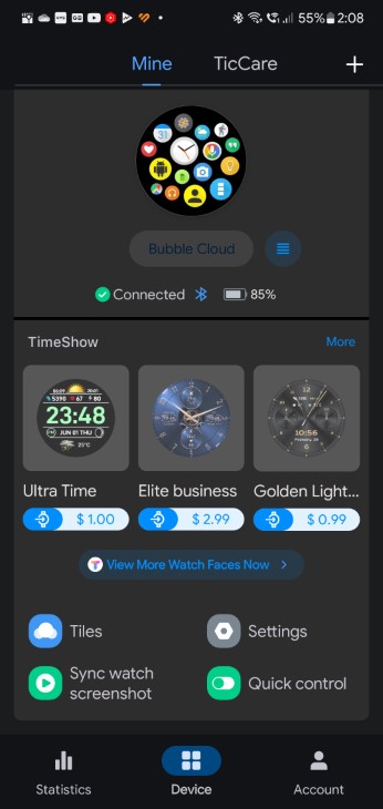
For users who have a single Wear OS watch, having the brand-specific control app on the phone simplifies things. They only need to install the new Mobvoi Health app and don’t require Google’s Wear OS app. However, for those of us with multiple Wear OS watches, this adds to the confusion. Now, I have to keep the old “Mobvoi” app and Google’s Wear OS app installed for my TicWatch Pro 3 Ultra, and also have an almost identical (but different enough) “Mobvoi Health” app for the TicWatch Pro 5. Not to mention the additional apps like “Galaxy Wearable,” “Galaxy Watch,” “Samsung Health,” and “Samsung Health monitor” needed for my other Wear OS watch. This can quickly become a nightmare. Thank you, Google and friends!
More settings
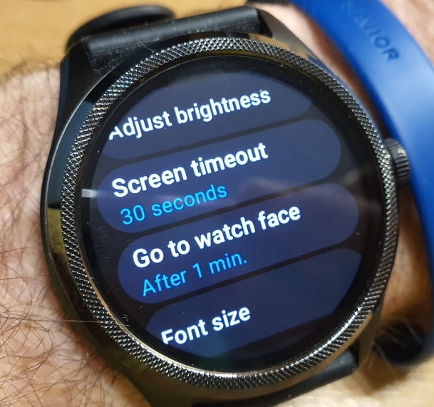
On the bright side, we finally get the long-awaited screen timeout settings with options for 5, 10, 15, and 30 seconds. However, we are losing wrist-gesture scrolling and the Notification Preview long-text complication for watch faces. To regain some level of wrist gesture control, I am happy to use the Bubble Cloud watch face. I also have the Notification Icons Plugin installed, which can display the contents of notifications on the watch face. It was much nicer when these features were available at the OS level without the need for third-party workarounds!
Speaking of third-party workarounds, we are no longer able to customize any of the button presses without apps like Bubble Cloud. The top button is hardcoded to “recents,” which is pretty useless for those of us accustomed to the Bubble Cloud launcher’s “Sticky open” option (which still works well, by the way). Long-pressing the crown does nothing out of the box, and there is no way to assign it to any app. Once again, a thoughtful move by Google and Mobvoi… Double-pressing the top button opens Google Pay (or Wallet now? More on it later), and single-pressing the crown switches between the watch face and Wear OS’s limited usability built-in “launcher,” which is essentially just an extremely long list of apps in alphabetical order.
The TicWatch Pro 5 is effectively unusable without Bubble Cloud. You need to install this launcher if you want to introduce any level of organization to your apps and watch face complications. It’s unfortunate that Google doesn’t provide an official way to replace the stock launcher, which barely offers the minimum functionality. With Bubble Cloud, I was also able to customize the secondary button and assign the long press of the main button to Google Assistant Go.
Google Pay
Setting up Google Pay (or Wallet) went smoothly on the TicWatch Pro 5. Unlike my experience with other Wear OS watches, it wasn’t a confusing procedure that required downgrading the app on my phone or navigating through my mobile banking software. The TicWatch Pro 5 was the first watch where setup went without a hitch—just select the card and you’re done. However, when it came to actually making payments, I encountered some issues.

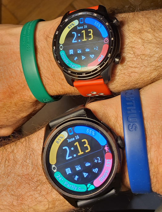
I never encountered any issues with NFC/Google Pay on any of my previous watches. If a terminal couldn’t read my watch on the first attempt, it always worked on the second try. However, I’m facing trouble with payments using my TicWatch Pro 5. While it functions with some terminals, I’ve noticed that I need to hold it much closer. Unfortunately, it fails to work with other terminals even after multiple attempts. Luckily, I had my older TicWatch Pro 3 Ultra on my other wrist (yes, like Inspector Gadget, they already know me at the local store…) and managed to complete the payment after the TicWatch Pro 5 failed three times. This issue could be related to either the NFC antenna strength, something specific to Wear OS 3, or the watch being new. It’s a bit disappointing after the initially smooth setup experience.
Of course I hope the NFC issue can be sorted out with software updates, because the refreshed look of Wear OS is otherwise very appealing. New animations
Is it a keeper?
It should be. There is enough good to balance out the bad. Google’s omissions can be worked around, and the improved Mobvoi features are really attractive. For me, personally LTE on my TicWatch Pro 3 Ultra has spoiled me. I will surely switch to the TicWatch Pro 5 LTE, if and when it comes out. Until then, LTE autonomy of my TicWatch Pro 3 Ultra might outweigh the benefits this slightly faster watch on newer but more limited version of Wear OS can offer.
If someone is transitioning from a non-LTE TicWatch Pro 3 Ultra or any other less capable Wear OS watch, and LTE is not an essential requirement, the TicWatch Pro 5 is certainly worth the upgrade.
