![]()
After much struggle Google finally allowed me to publish an update to the Notification Icons app with a much requested new feature:
- We can now recolor the notification icons which are used in watch face complications (see details below)
Other changes in this release:
- Improved the look of the introduction screens
- Enabled rotary input on all screens (new Google requirement, so they can sell more of their garbage battery-life watches — instead of making rotary input work on scrollable views globally at the OS level, they terrorize developers to add the functionality to each of their screens… My app had rotary input on all main screens of the app. Only a few single-use introductory screens did not have it)
- Changed the background color of a single-use intro screen from dark gray to black. This is another new Google requirement to help them hide the fact that their Pixel watches have humongous bezels, so they terrorize developers to change all screen backgrounds to black. Of course my apps all have black backgrounds for power saving and burn in protection, but they blocked app updates, because one of the introductory screens of the app had a dark gray background. This intro screen is viewed a single time for 10 seconds by some of the users…
Google is now actively looking for pretext to remove apps from Google Play. [sorry for the rant, but this is getting ridiculous]
Recolor icons
Notification provider apps are supposed to provide white icons, some apps (Google’s “Messages” app in particular doesn’t adhere to this). Watch faces are responsible for coloring their complications according to their style, but some watch faces fail to do this (Samsung official watch faces in particular).
The combination of an improper notification provider (Google) matched with a watch face that handles complications in an improper way (Samsung). If either works correctly you wouldn’t see the effect of the neglect of the other.
Out of these two, we tiny app developers are the easiest to reach, and when Google lets me, I am happy to add the workaround for these failures.
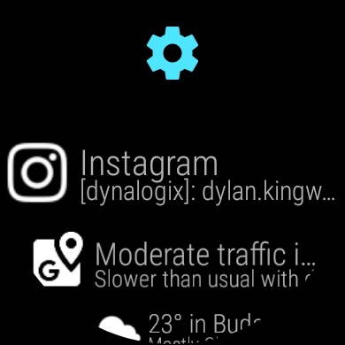
Access the new option in the app-settings on the watch: long press the blue cog icon on the top of the notification list screen:
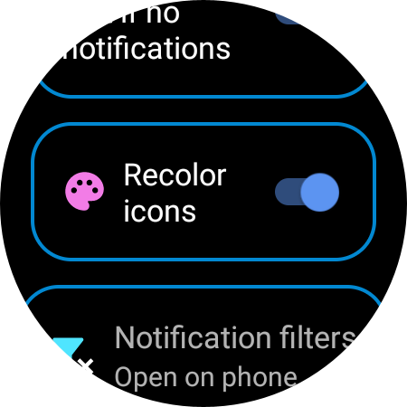
If Bubble Cloud is installed, Single press will take you to the bubble configuration, where you can set the icon color in the Bubble Cloud, but for the complication icon color, long press the blue cogs icon and look for this “Recolor icons” setting:

When the switch is turned on the color shown in the palette is going to be used for the icons. If the switch is turned off, the icon’s original color is going to be used (as in earlier versions of my app). By default the switch is off. Note: The new icon colors are also used in the notification list of the app.
Make sure to update both the watch and phone components of the app to version 4.13.